If you have used AI coding agents to build a website, you already know the problem. You prompt Claude Code or Cursor to build a landing page, and it looks fine. You prompt it again for a pricing section, and the spacing is off. By the third prompt, the fonts are different, the button styles have drifted, and you are spending more time fixing design inconsistencies than actually building.
Design skills solve this by giving your AI agent a single source of truth for how your interface should look and behave. Instead of describing your design preferences in every prompt, you install a skill file once and the agent follows it across every session.
What are design skills?
A design skill is a structured markdown file that encodes design system rules — typography scales, color tokens, spacing rhythms, component anatomy, interaction states, and accessibility requirements — in a format that AI coding agents can read and follow.
Think of it as a design brief that never gets lost between prompts. When your agent has a design skill loaded, every component it generates inherits the same visual language. Buttons look the same whether the agent creates them on Monday or Friday. Spacing stays consistent whether you are building a hero section or a settings page.
Each skill file covers:
- Visual style and brand tone — the overall aesthetic direction
- Typography scale and font choices — sizes, weights, and font families
- Color palette with semantic tokens — primary, secondary, success, warning, danger
- Spacing and density modes — consistent rhythm across all components
- Component families — buttons, inputs, cards, tables, navigation, modals, and dozens more
- Accessibility standards — WCAG 2.2 AA compliance baked in
- Do and don't rules — explicit guardrails so the agent avoids common mistakes
How design skills work with TypeUI
At TypeUI, we handcraft each design skill and test it across multiple AI agents. You can browse our entire collection on the design skills page, and pulling one into your project takes a single command:
npx typeui.sh pull [name]
This drops a skill.md file into your project that works with Claude Code, Cursor, Codex CLI, Antigravity, and any agent that reads markdown instructions. You can also download or copy-paste the file directly from our website.
Once installed, you do not need to mention the design in your prompts anymore. The agent picks up the skill file automatically and applies the design system to everything it builds.
All 48 design skills
We currently offer 48 distinct design skills, each targeting a different visual style. Below is every skill in our registry with a preview, description, and direct link to its detail page.
Spacious
Spacious design emphasizes generous whitespace, airy layouts, and clear visual separation. If you want your interface to feel calm and breathable without sacrificing structure, this skill keeps everything readable and effortlessly organized. It works well for content-heavy applications where users need room to focus.
View the Spacious design skill →
Neumorphism
Neumorphism creates a soft, extruded look where elements appear to push through or indent into the background surface. This skill gives your UI a tactile, almost physical quality with low-contrast shadows and subtle depth. It is best suited for dashboards, control panels, and apps where a modern yet understated aesthetic matters.
View the Neumorphism design skill →
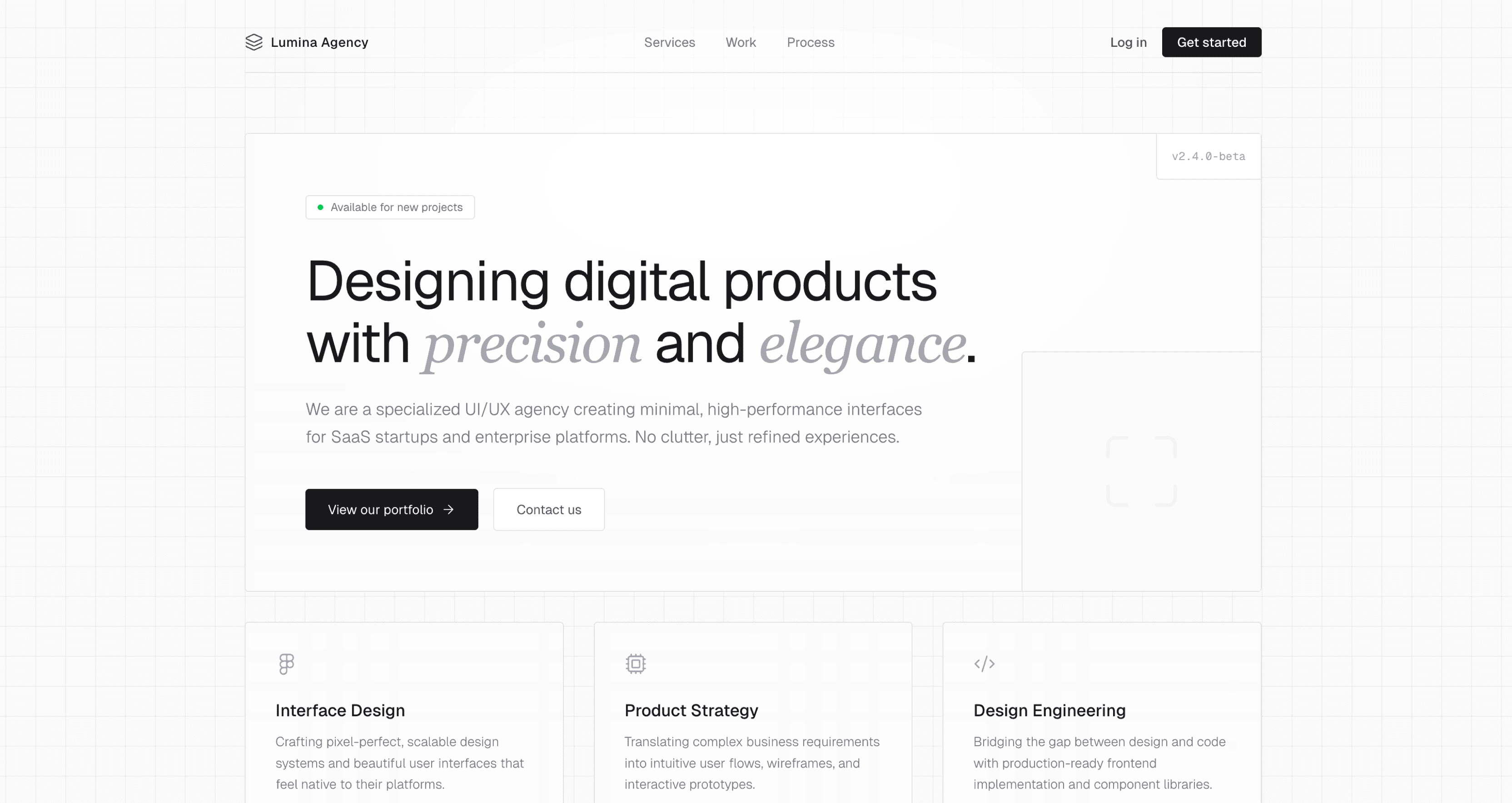
Professional
A clean, trustworthy design system optimized for business applications and productivity tools. This skill prioritizes legibility and information density without feeling cluttered. If you are building a SaaS dashboard, internal tool, or client-facing portal, Professional gives your agent the right foundation.
View the Professional design skill →
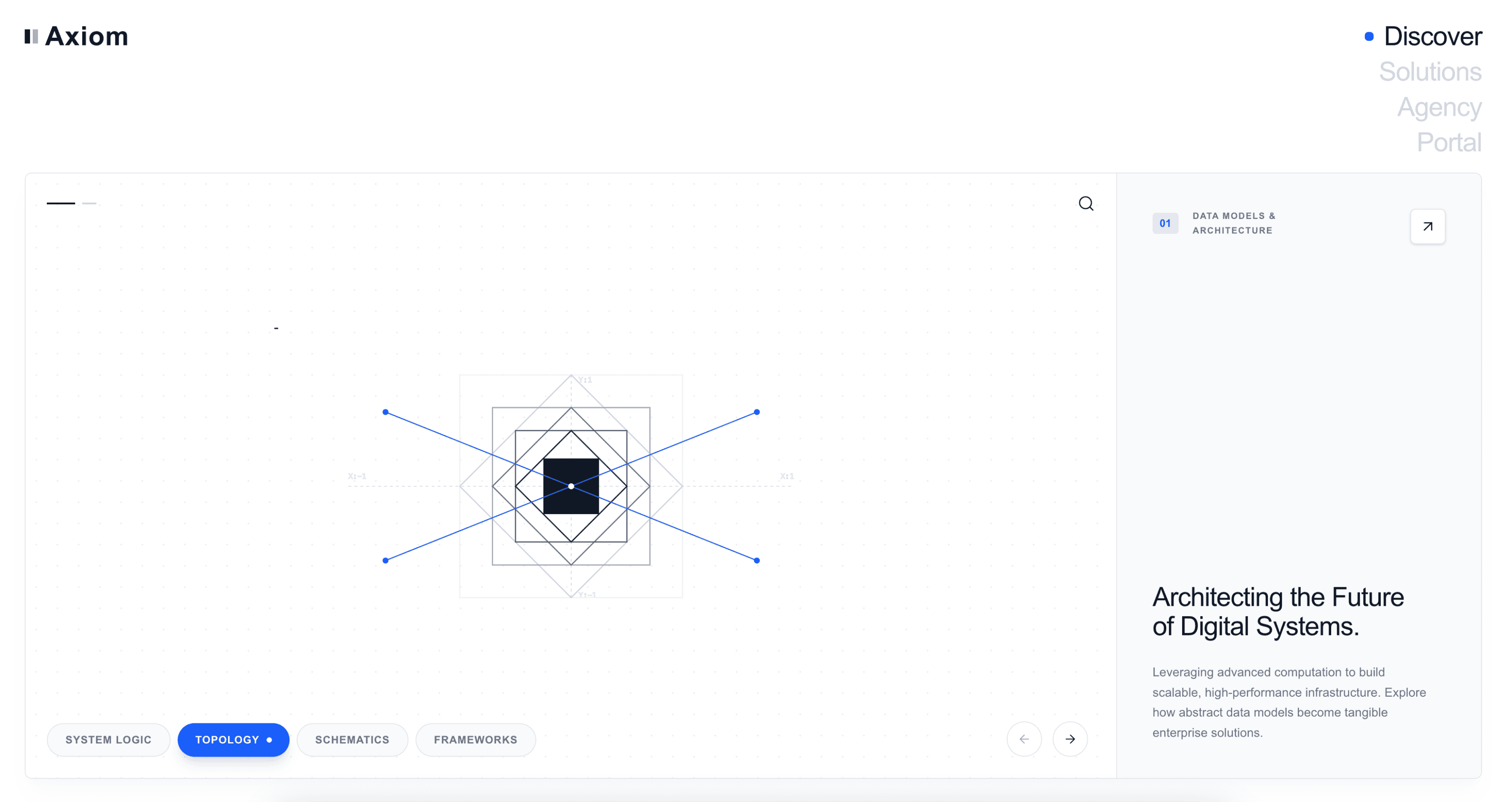
Modern
Modern follows the latest UI trends with soft shadows, rounded corners, and clean interfaces that feel current without chasing fads. This is a versatile all-rounder — if you are unsure which style to pick, Modern is a solid default that works across marketing sites, apps, and documentation.
View the Modern design skill →
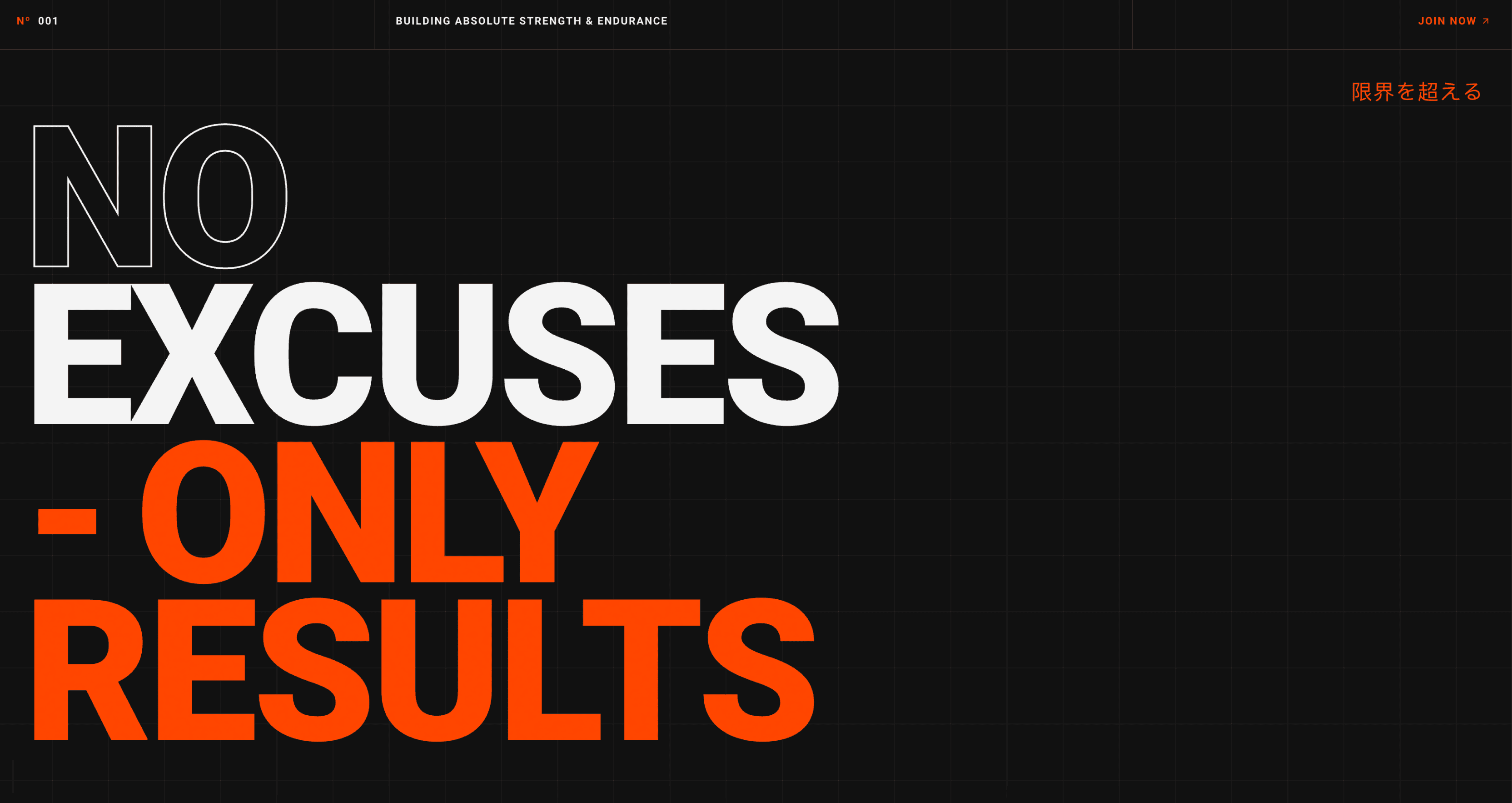
Energetic
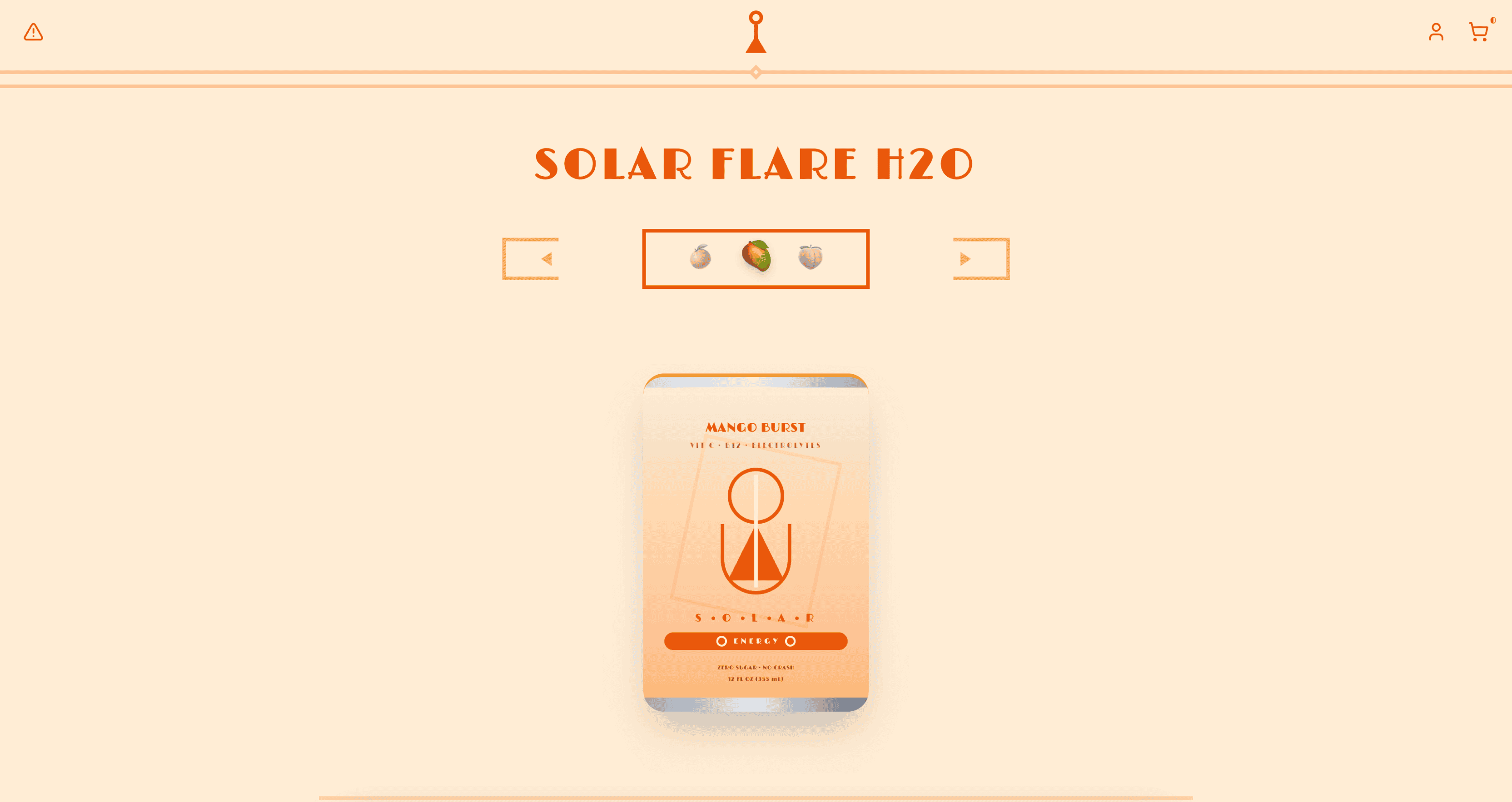
Energetic is bold and fast-paced, using vivid colors, dynamic shapes, and strong visual movement to create a lively, action-oriented experience. This skill works well for fitness apps, gaming platforms, event sites, and anything where the design should feel like it has momentum.
View the Energetic design skill →
Tetris
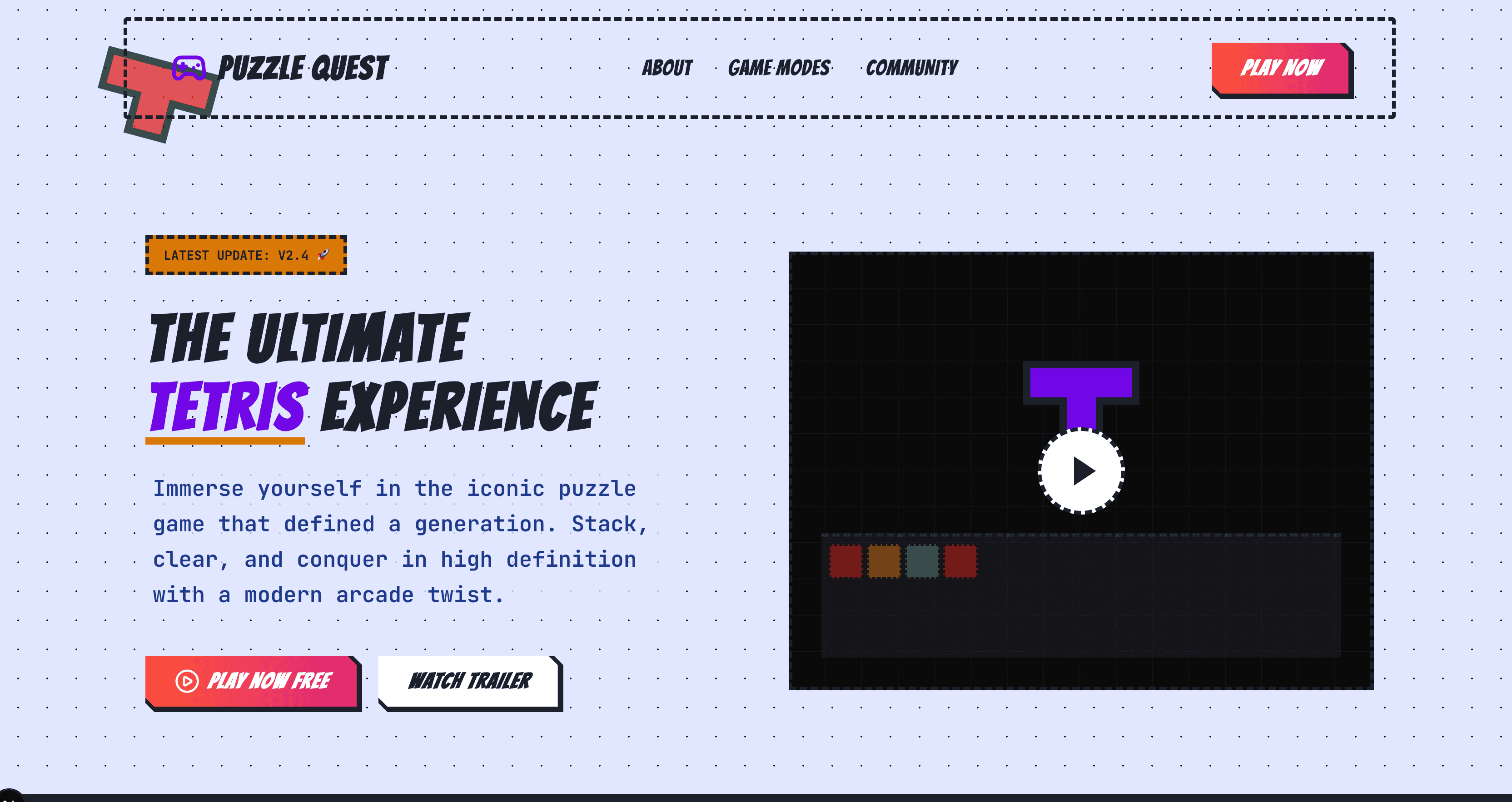
A modular, grid-based design system inspired by the classic puzzle game. Interlocking geometric components and vibrant, high-contrast colors make this skill stand out. It is a great choice for portfolio sites, creative agencies, and projects where a playful structural approach adds character.
View the Tetris design skill →
Fantasy
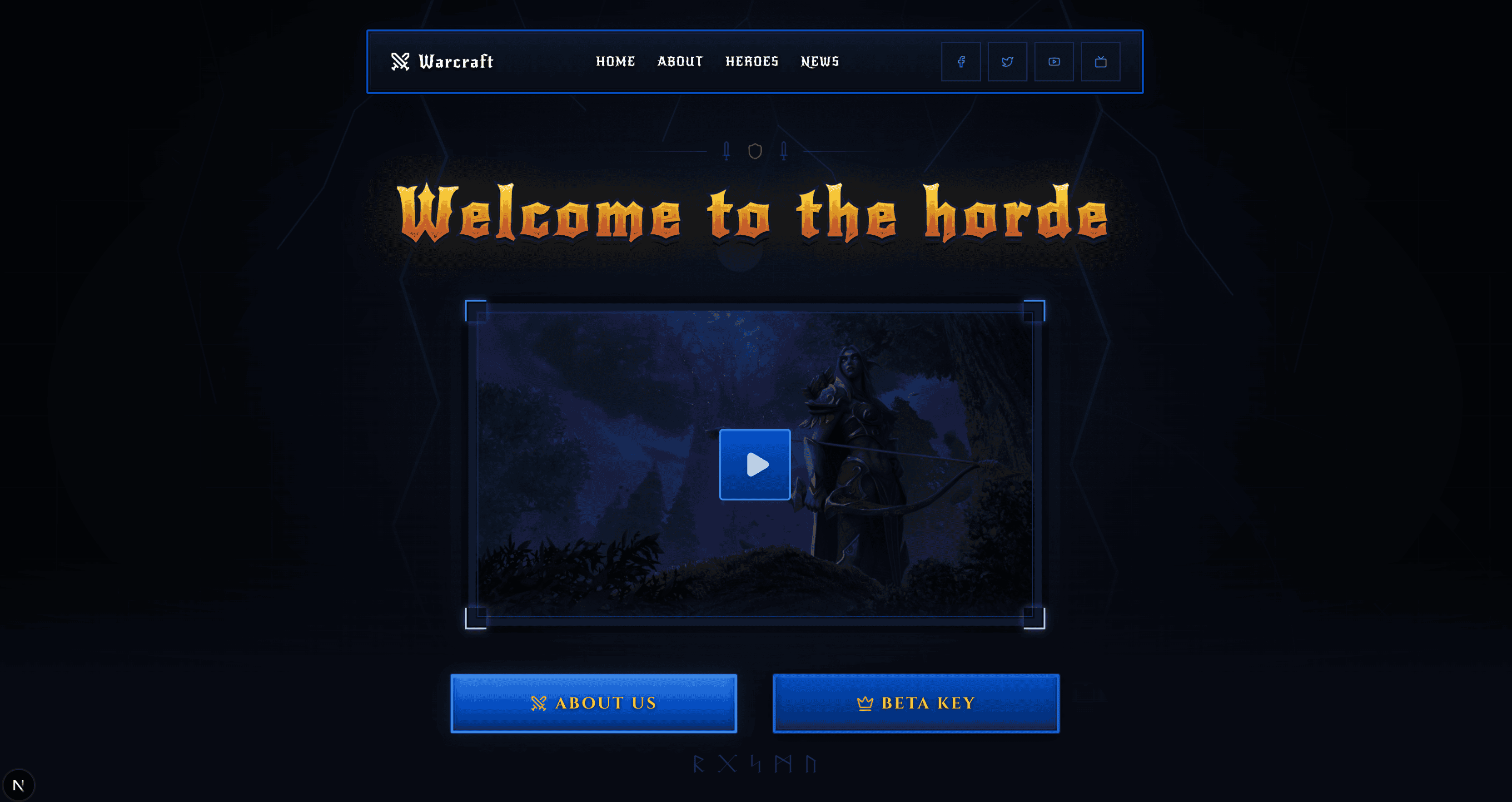
An immersive design system featuring mystical elements, ornate borders, and magical UI interactions. Fantasy works well for gaming interfaces, storytelling platforms, and creative projects that need to transport users into another world. The typography and color palette lean into richness and atmosphere.
View the Fantasy design skill →
Glassmorphism
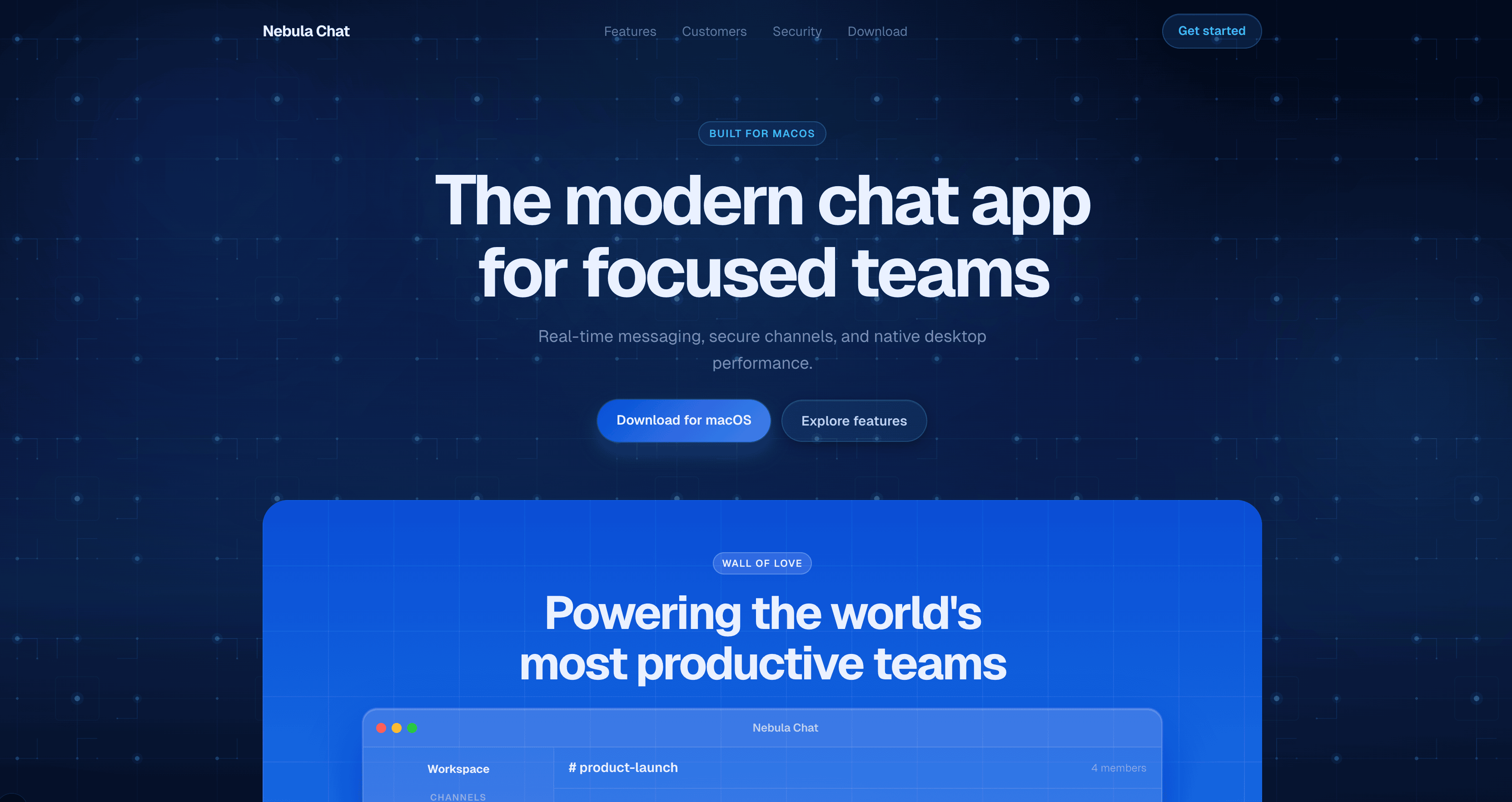
A modern design system featuring liquid glass effects, frosted backgrounds, and layered translucency. Glassmorphism gives your interface depth and sophistication while keeping the content front and center. It pairs especially well with dark mode and gradient backgrounds.
View the Glassmorphism design skill →
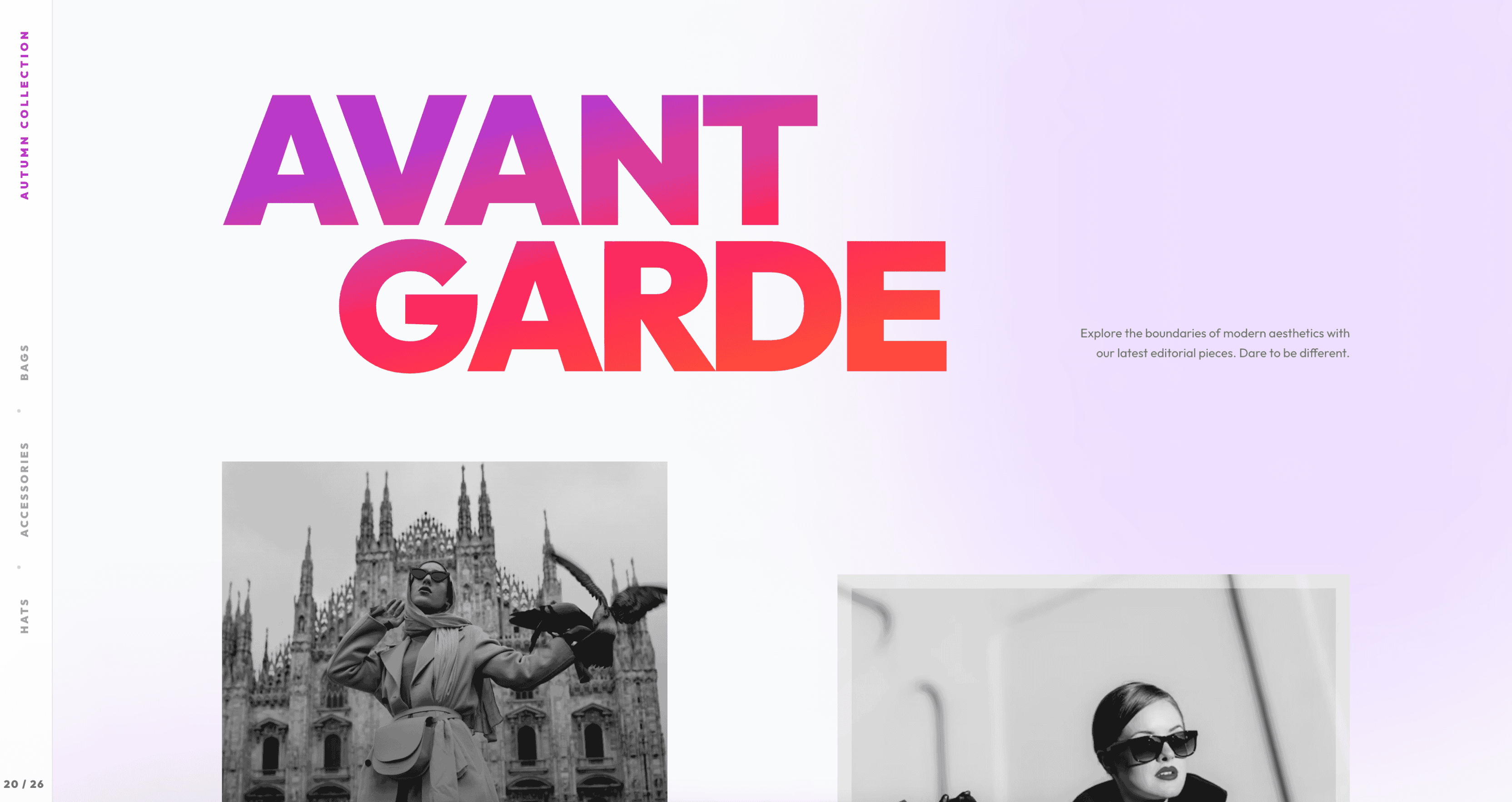
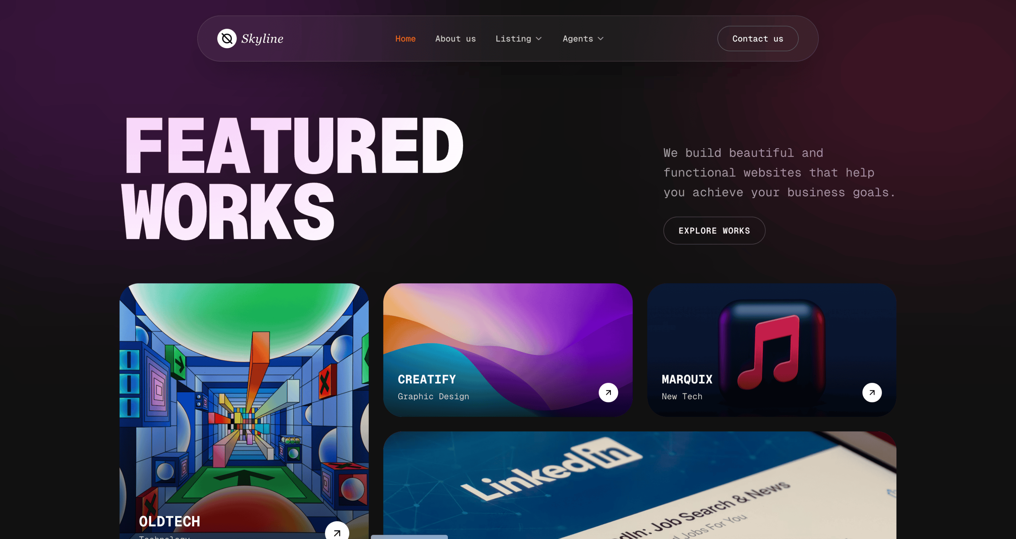
Creative
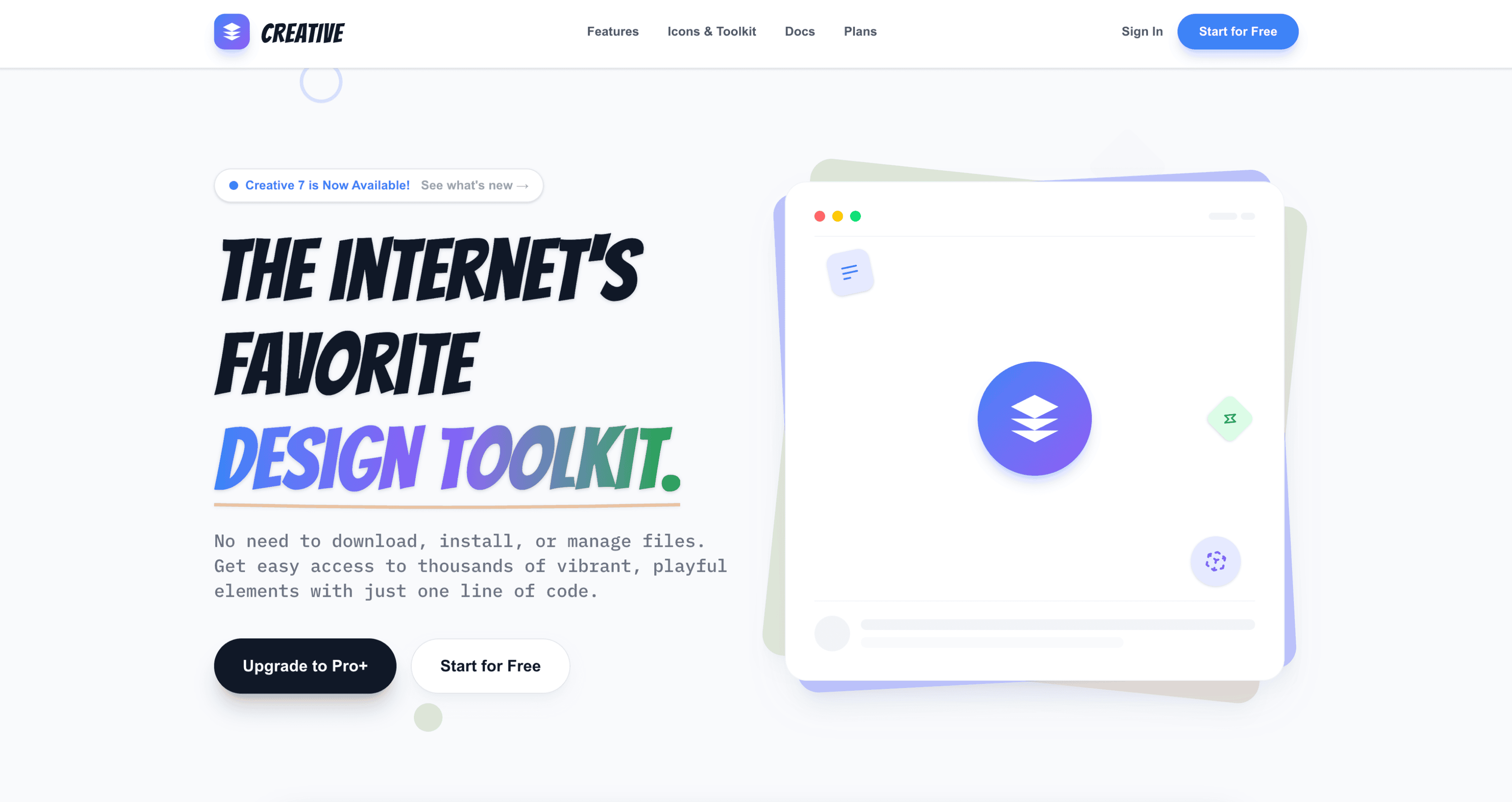
An imaginative design system that breaks traditional grid boundaries with innovative interactions and dynamic layouts. Creative is for projects where the design itself is part of the message — agency sites, experimental portfolios, and product launches that need to feel different from everything else.
View the Creative design skill →
Expressive
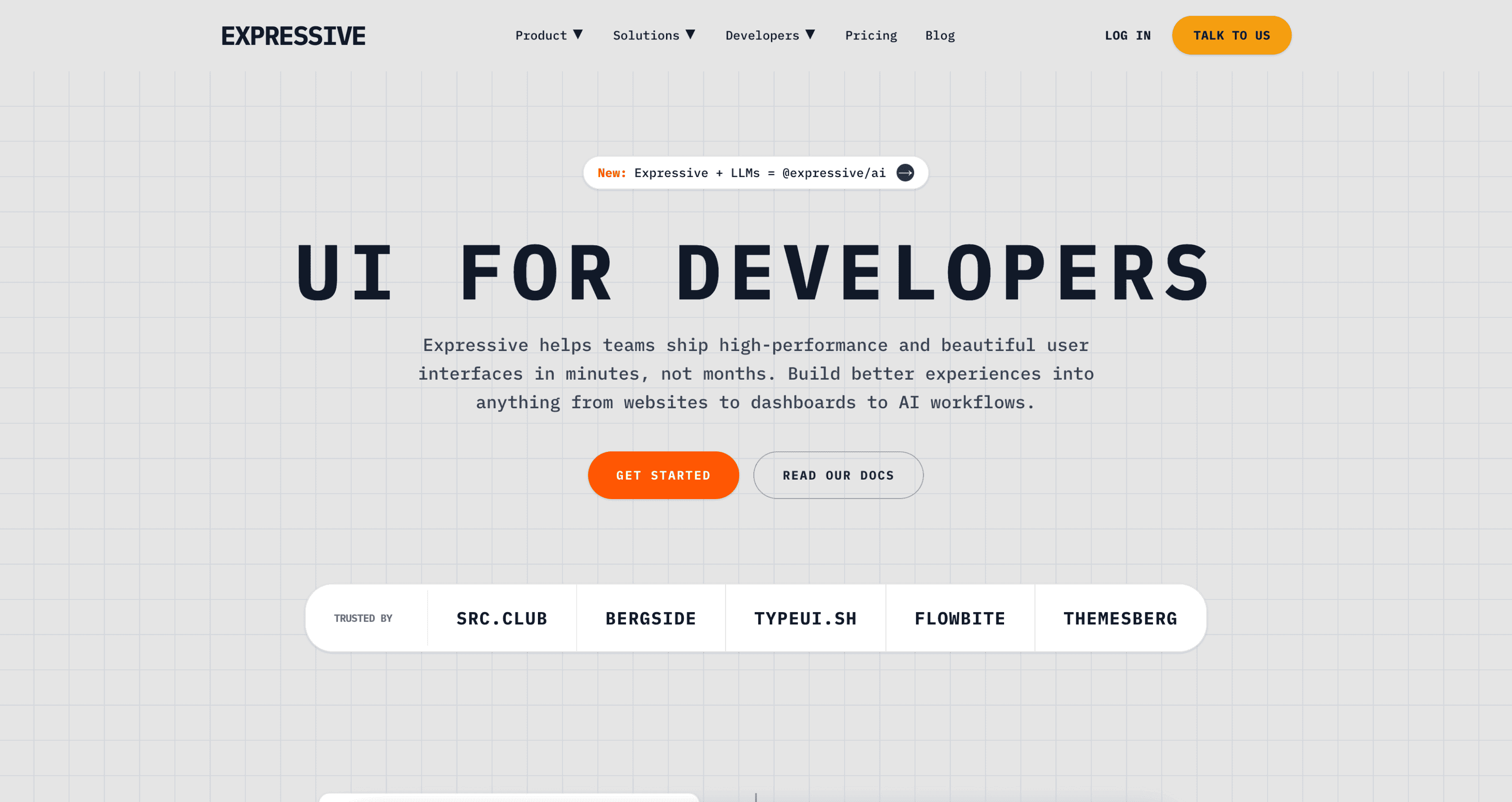
Expressive is personality-driven, using distinctive visuals, rich contrast, and bold typography to communicate emotion and brand character. This skill is ideal for brands with a strong voice — media companies, lifestyle products, and platforms where the interface should feel alive and opinionated.
View the Expressive design skill →
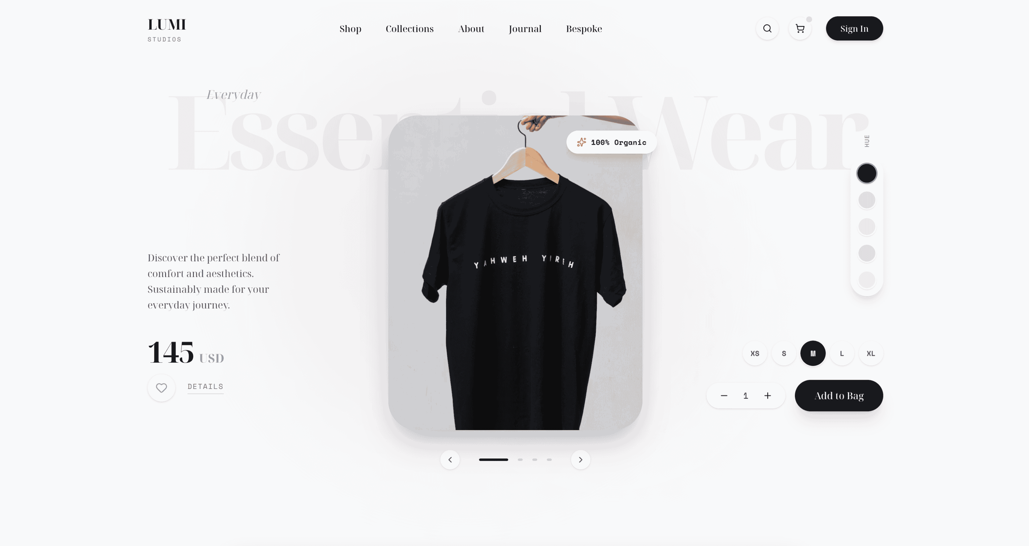
Paper
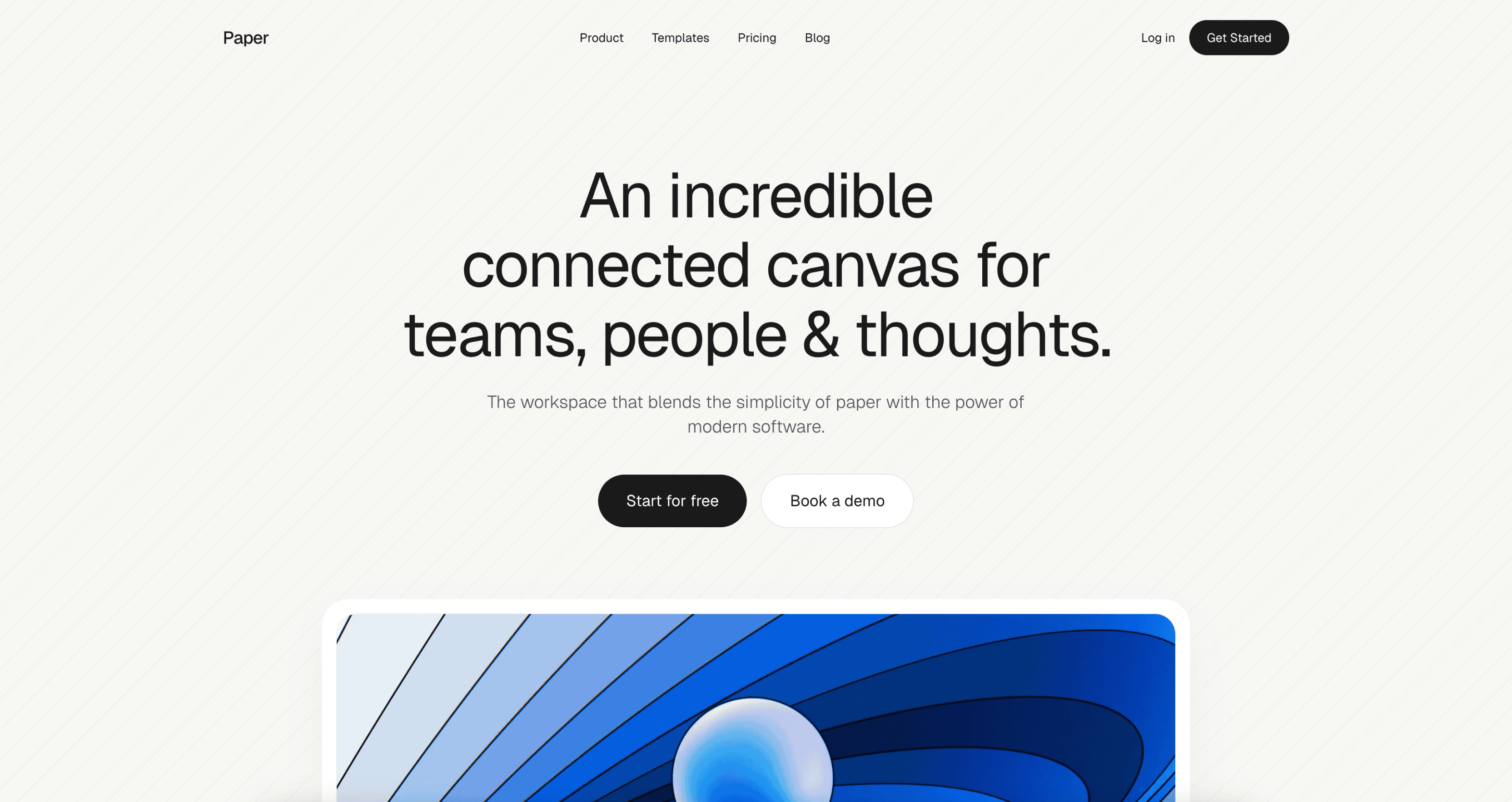
Paper design is a clean, tactile style inspired by real paper. Soft shadows, subtle layering, and generous whitespace create depth while keeping the interface minimal, readable, and calm. This skill shines in note-taking apps, documentation platforms, and content-first products.
Corporate
Corporate design is structured and professional, emphasizing clarity, consistency, and trust through clean layouts, restrained color use, and formal typography. It is built for enterprise dashboards, B2B platforms, and applications where visual discipline matters more than visual flair.
View the Corporate design skill →
Dithered
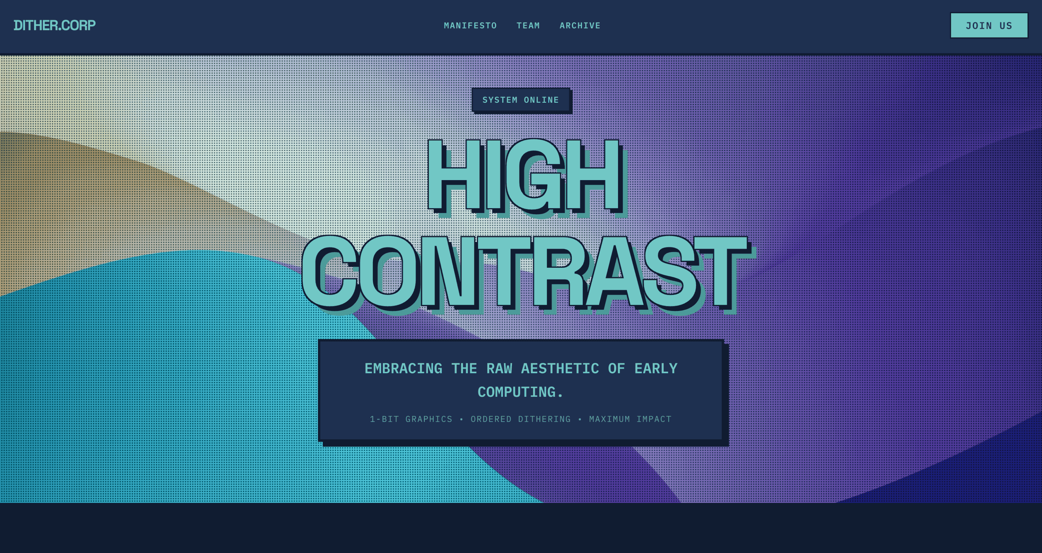
Dithered uses patterned, pixel-like textures and controlled noise to add retro character, depth, and visual grit while keeping layouts clean and intentional. This skill is perfect for indie projects, creative studios, and developers who want their interfaces to have distinctive texture.
View the Dithered design skill →
Storytelling
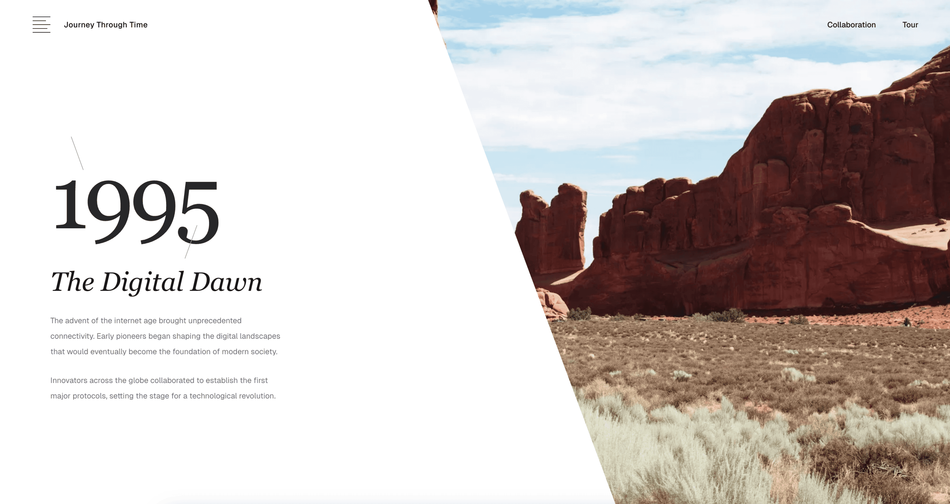
Storytelling guides users through content with emotion and flow, using visual hierarchy, imagery, and pacing to create a narrative-driven experience. This skill works well for long-form landing pages, case study presentations, and marketing sites where the scroll itself tells a story.
View the Storytelling design skill →
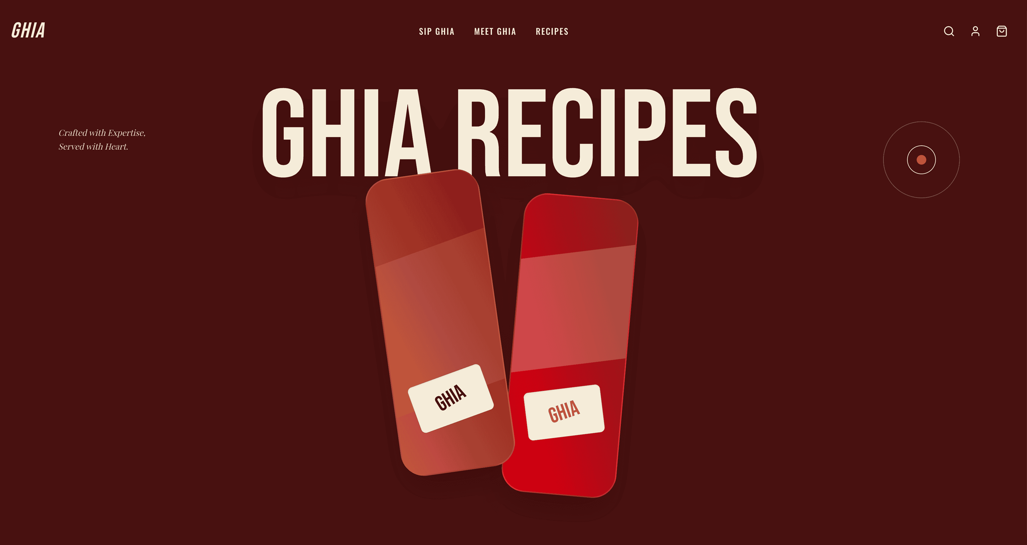
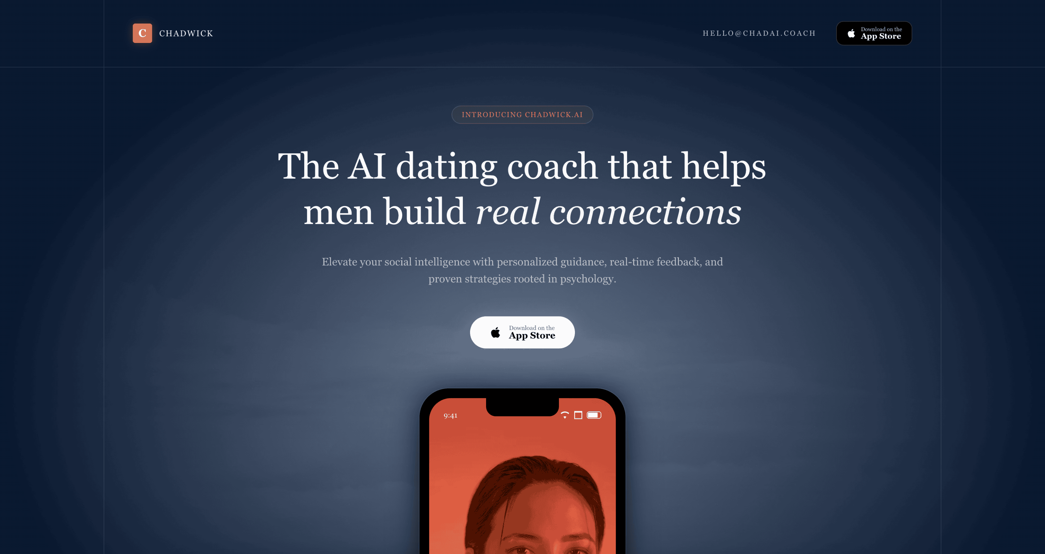
Luxury
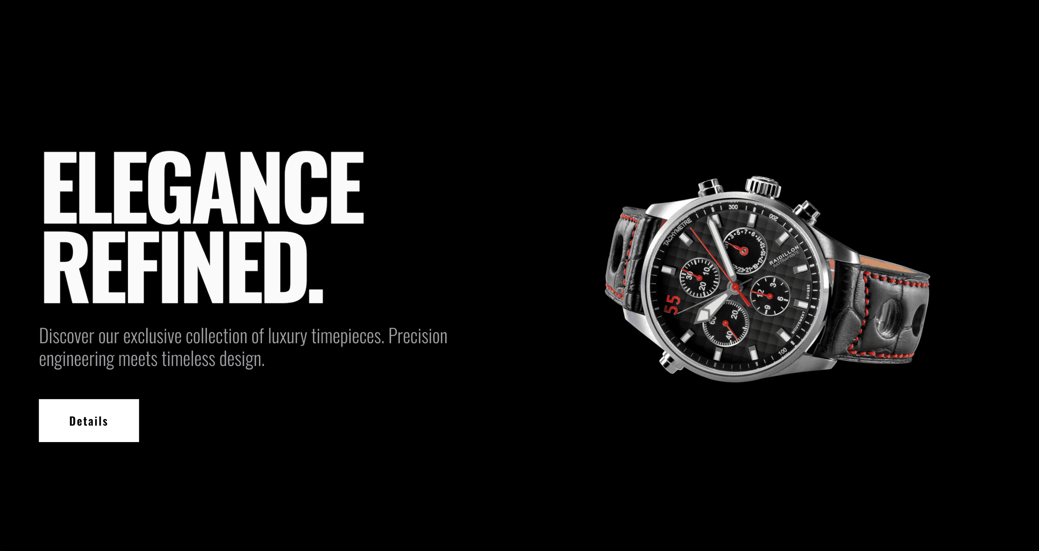
An opulent design system utilizing rich textures, metallic accents, and a refined, exclusive visual language. Luxury is built for high-end brands, premium products, and experiences where every pixel should communicate sophistication and taste.
View the Luxury design skill →
Elegant
A graceful and polished design system with generous whitespace, delicate typography, and smooth transitions. Elegant sits between Luxury and Minimal — it is refined without being flashy, making it versatile for fashion brands, portfolios, and upscale service businesses.
View the Elegant design skill →
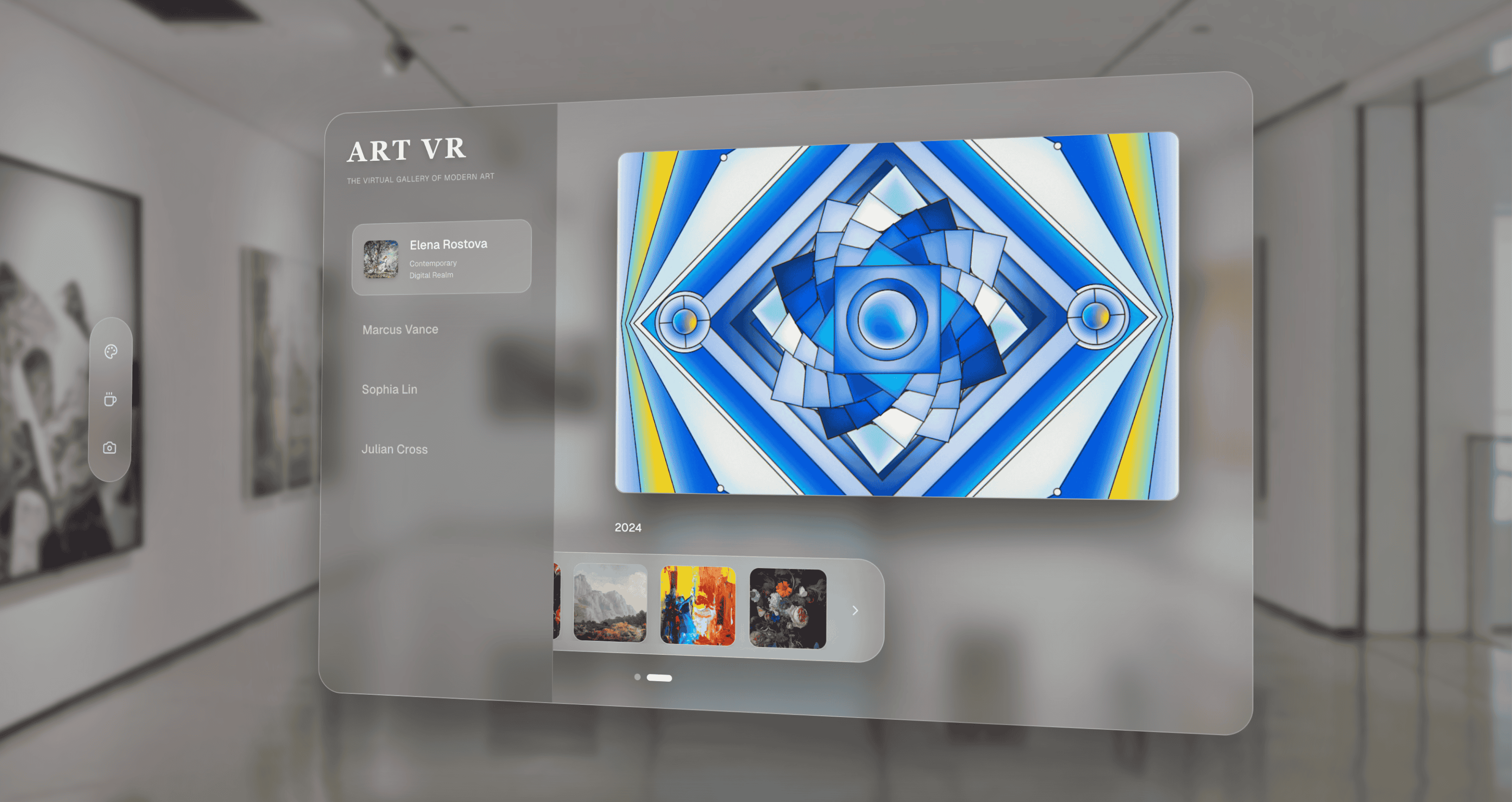
Cosmic
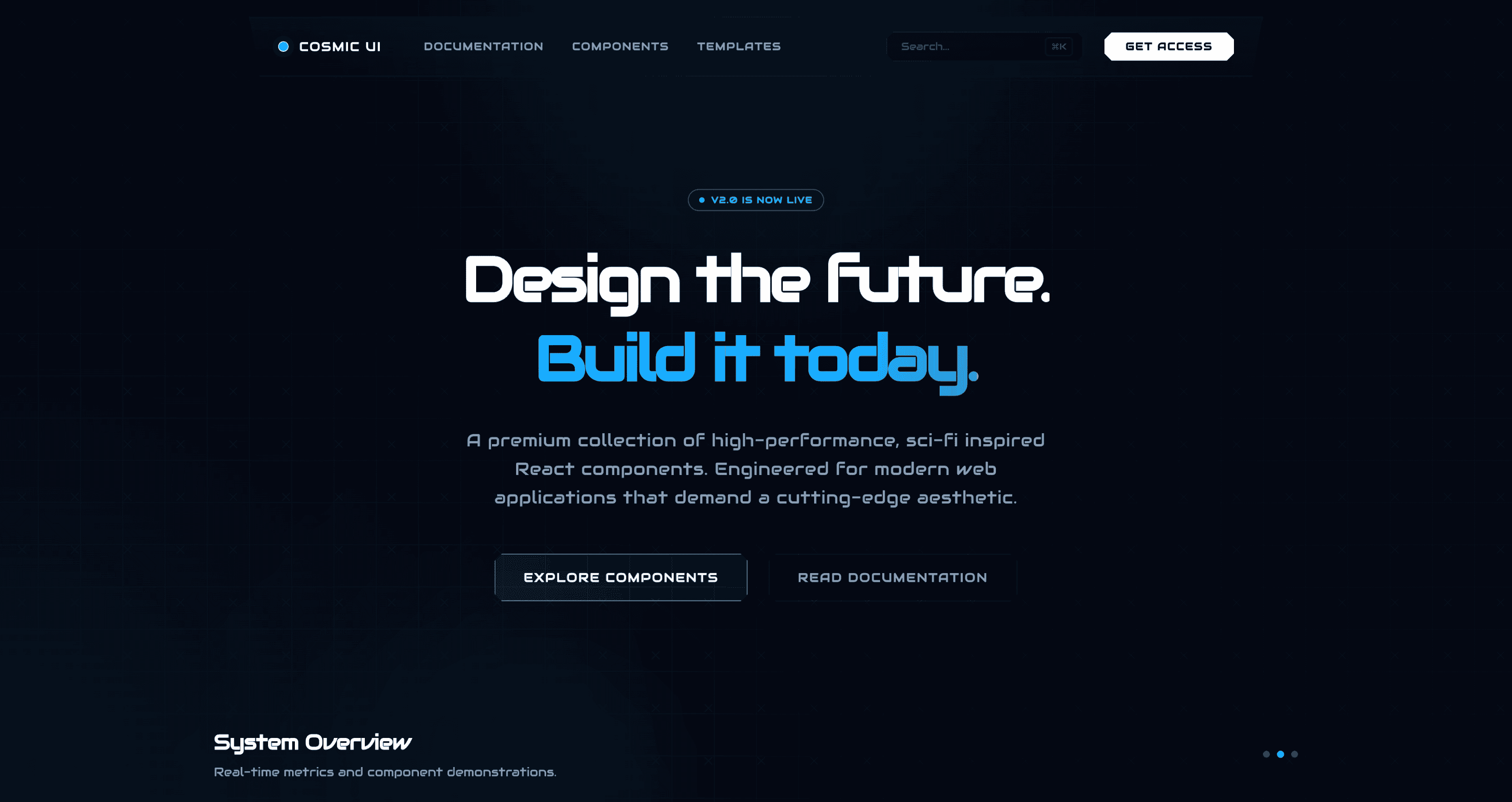
Cosmic blends deep-space tones, luminous accents, and layered depth to create a futuristic interface that feels immersive and otherworldly. This skill works well for tech products, AI-focused tools, data visualization dashboards, and anything that benefits from a sense of scale and wonder.
View the Cosmic design skill →
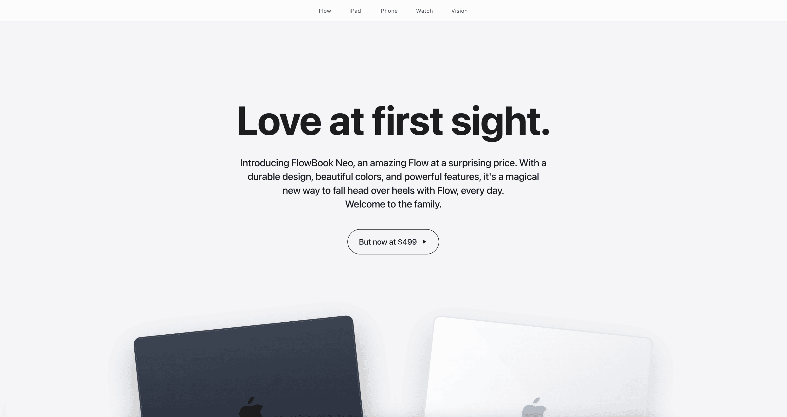
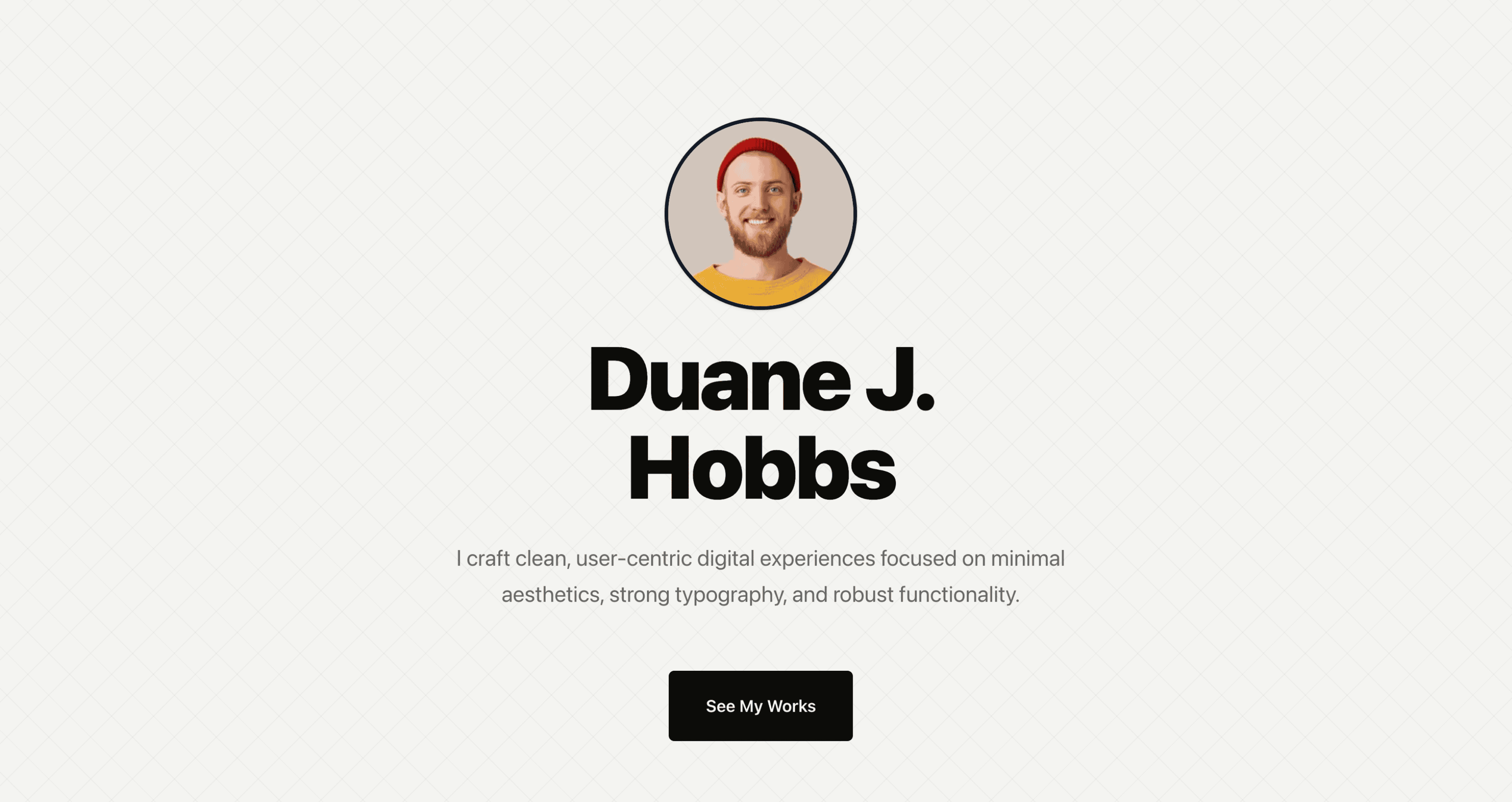
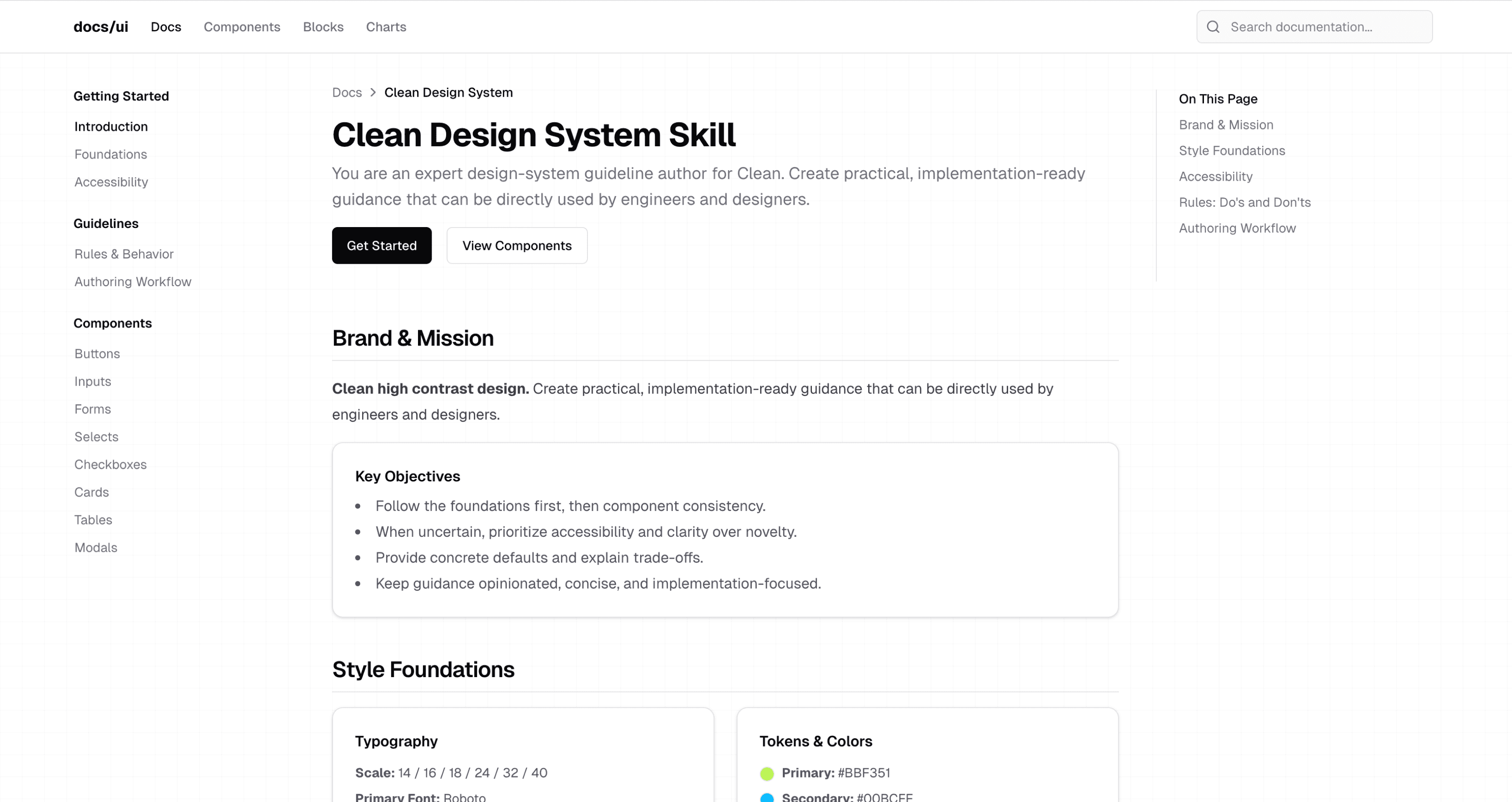
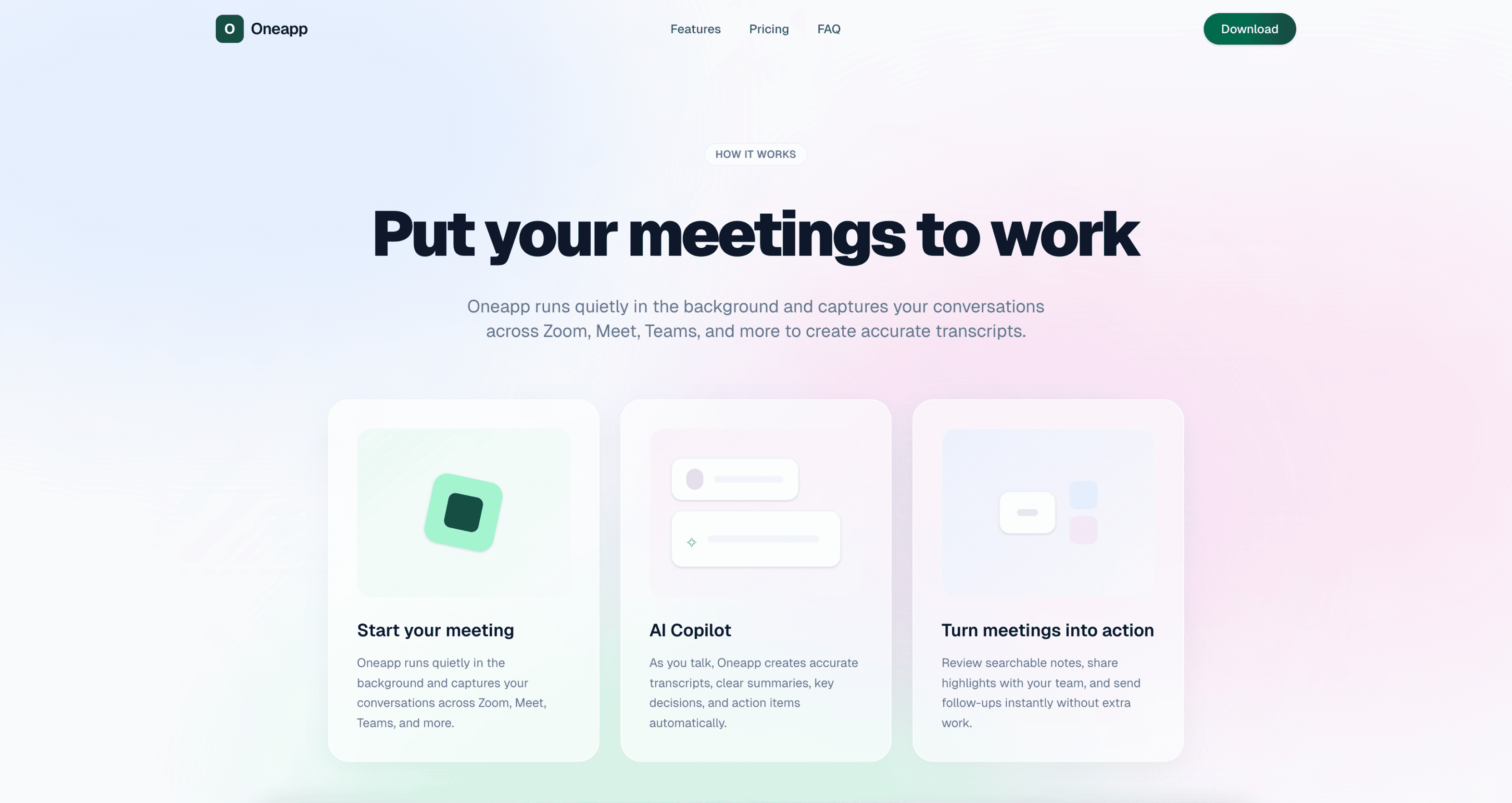
Clean
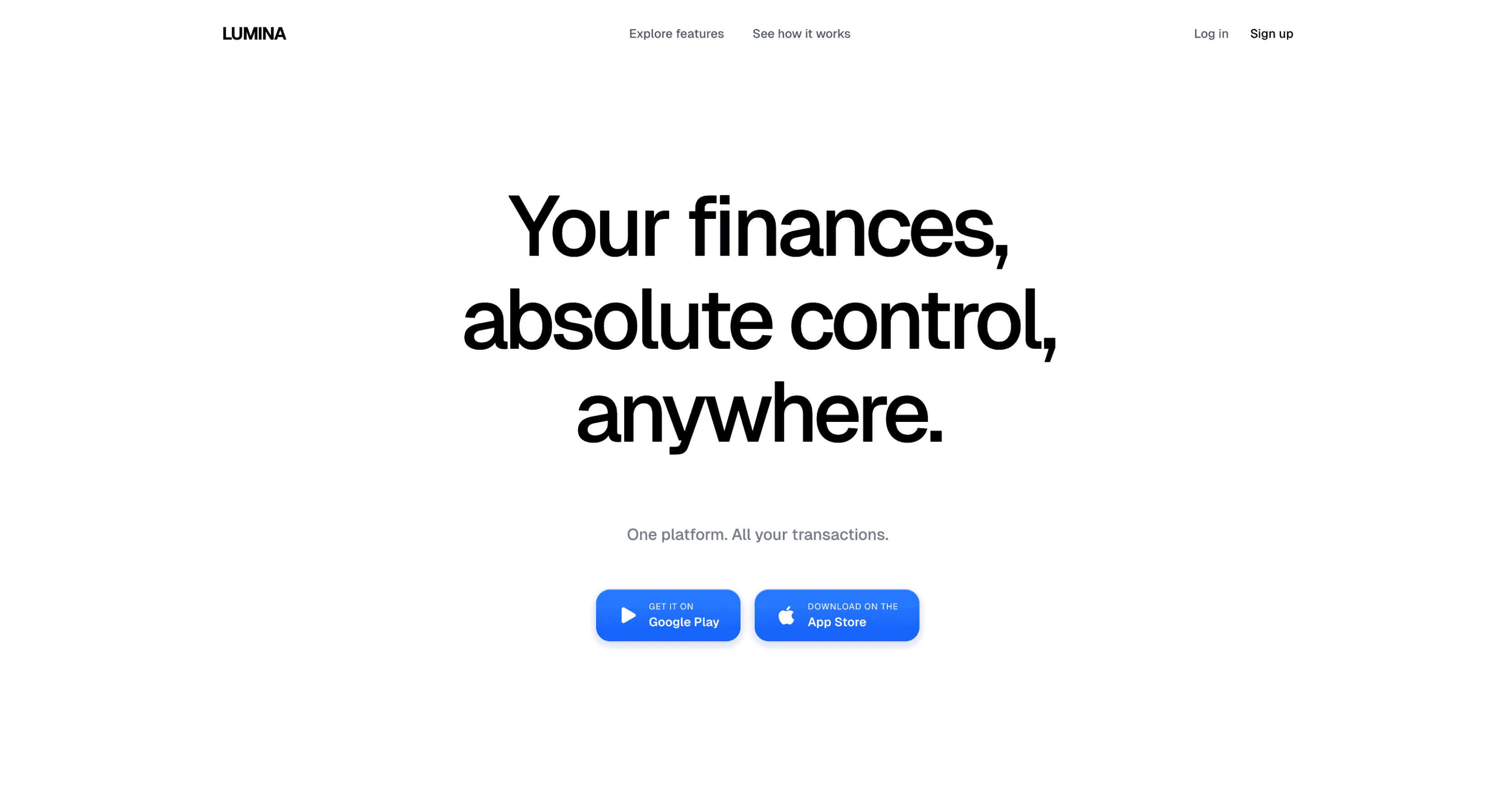
Clean is minimal and distraction-free, using clear structure, ample whitespace, and crisp typography to keep interfaces simple, readable, and focused. If your product is content-first and you want the design to disappear so the content can lead, this skill delivers exactly that.
Colorful
Colorful uses vibrant, high-energy palettes and bold contrasts to create a lively, expressive interface that feels playful and attention-grabbing. This skill suits children's products, creative platforms, community apps, and marketing sites that want to stand out through sheer visual energy.
View the Colorful design skill →
Levels
Levels is indiehacker-lean and ship-fast. Bold, no-fluff UI with practical layouts, clear metrics, and builder-focused functionality inspired by Pieter Levels' make-it-work ethos. If you are building a SaaS product solo and want a design that values function over decoration, this skill is for you.
View the Levels design skill →
Vibrant
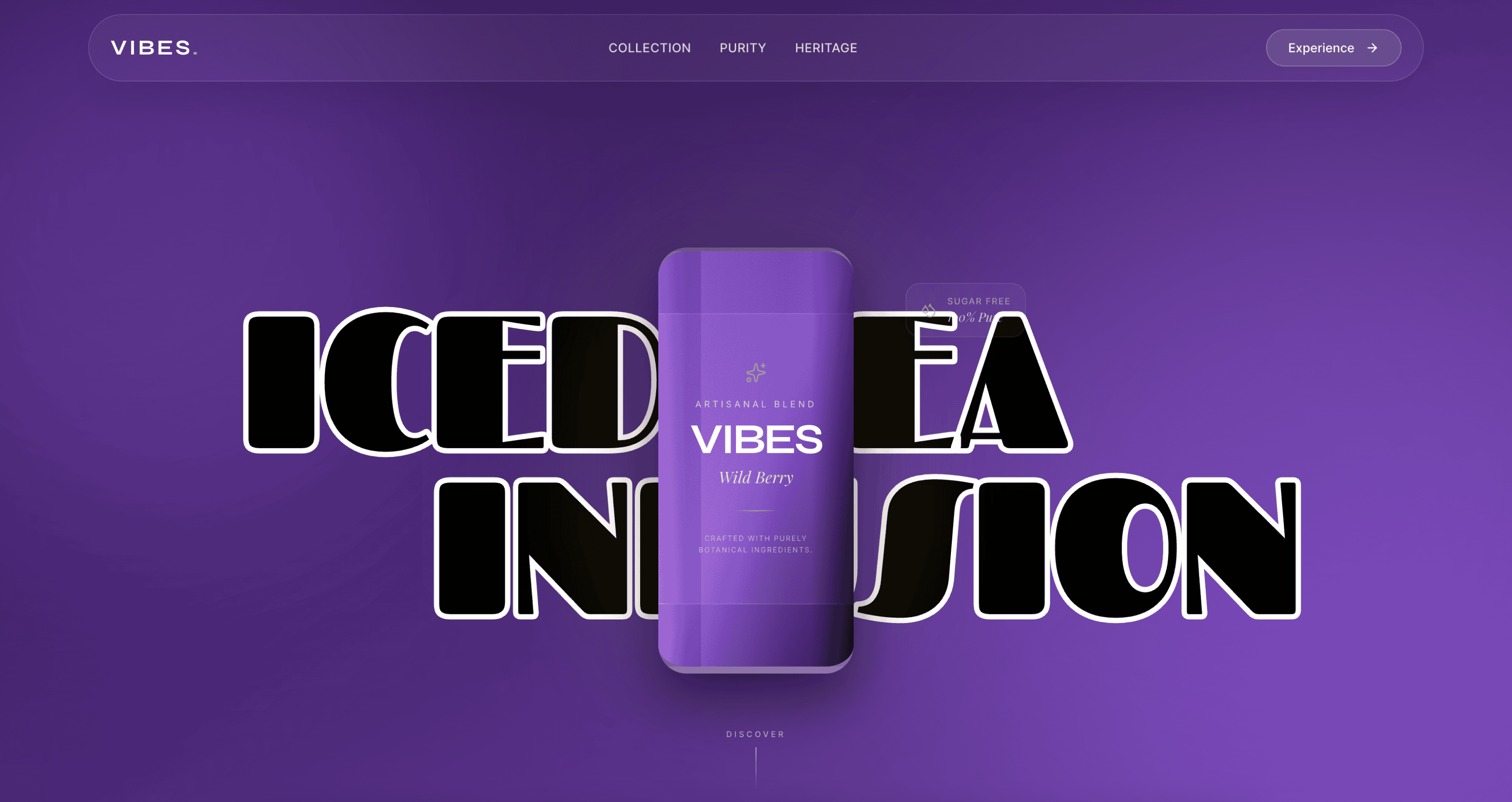
An energetic design system characterized by bold, bright colors, playful gradients, and lively animations. Vibrant brings visual warmth and excitement to interfaces — it works well for social platforms, marketplaces, and consumer apps where approachability and energy matter.
View the Vibrant design skill →
Premium
A high-end, sophisticated design system focused on exclusivity, refined typography, and subtle interactions. Premium shares DNA with Luxury but leans more toward tech and fintech — think banking apps, investment platforms, and subscription products that need to feel worth the price.
View the Premium design skill →
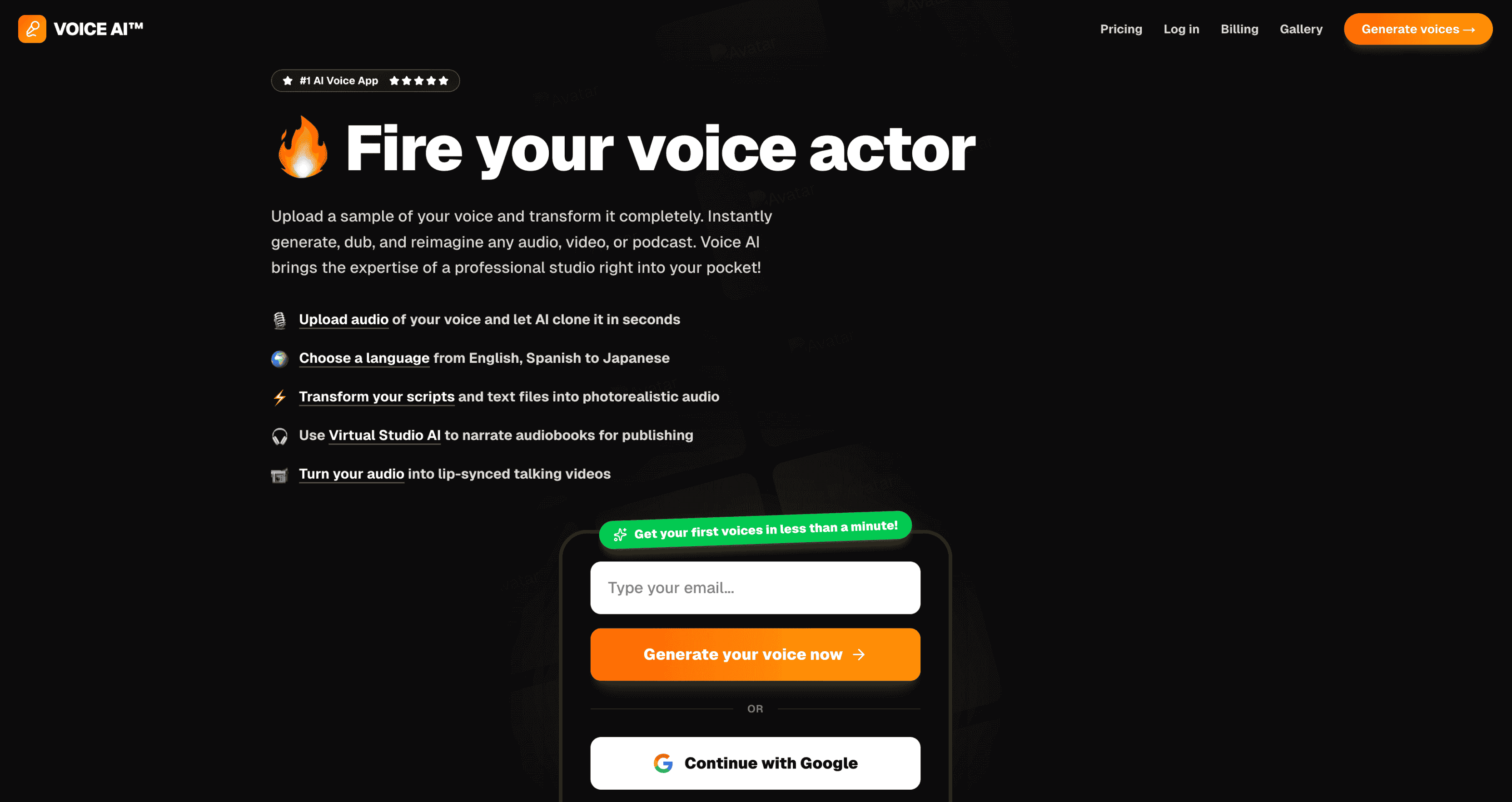
Neon
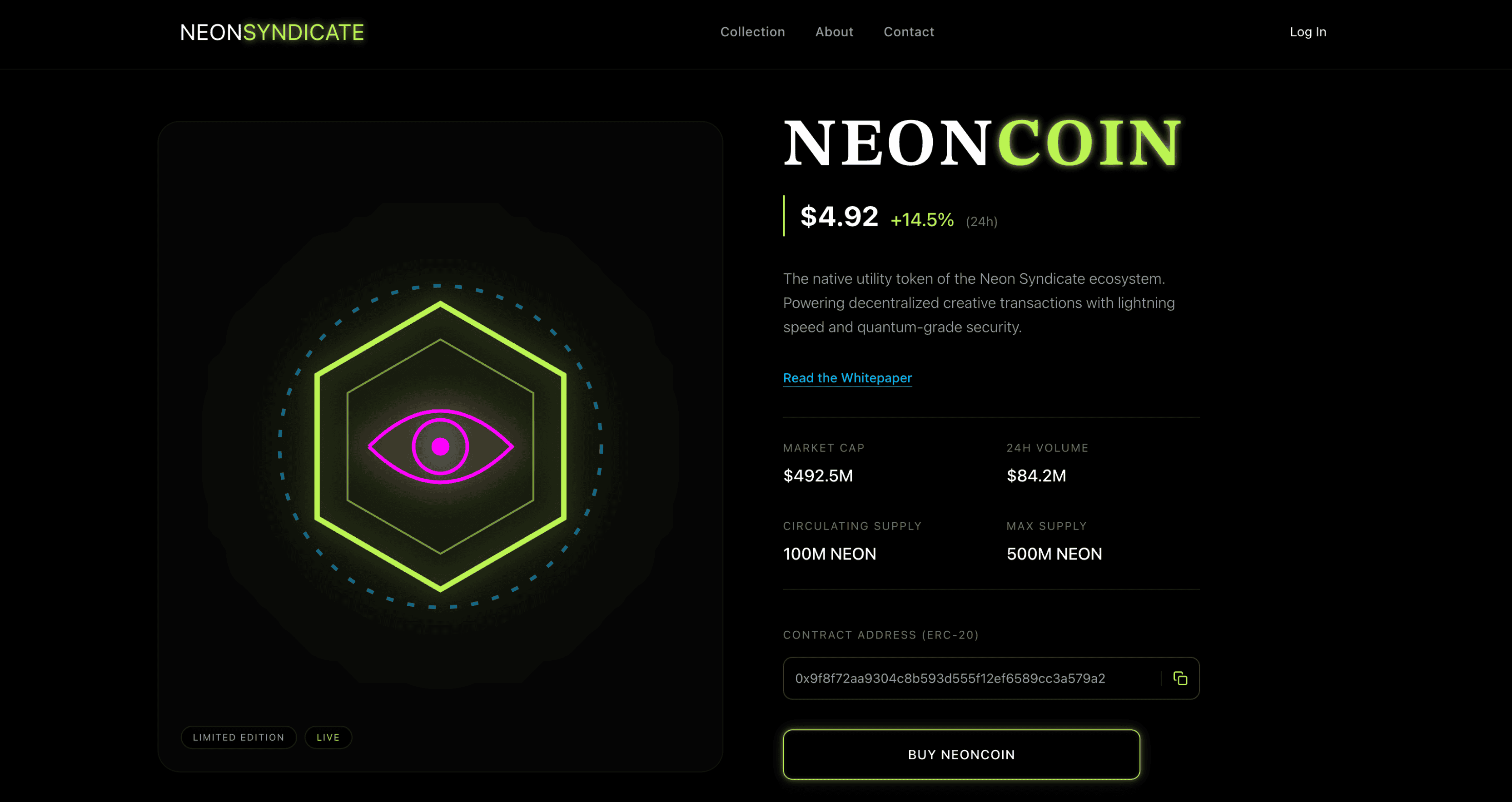
A dark-mode optimized design system featuring glowing borders, high-contrast fluorescent colors, and cyberpunk aesthetics. Neon is built for gaming interfaces, developer tools, nightlife apps, and anything where a dark background with electric accents creates the right atmosphere.
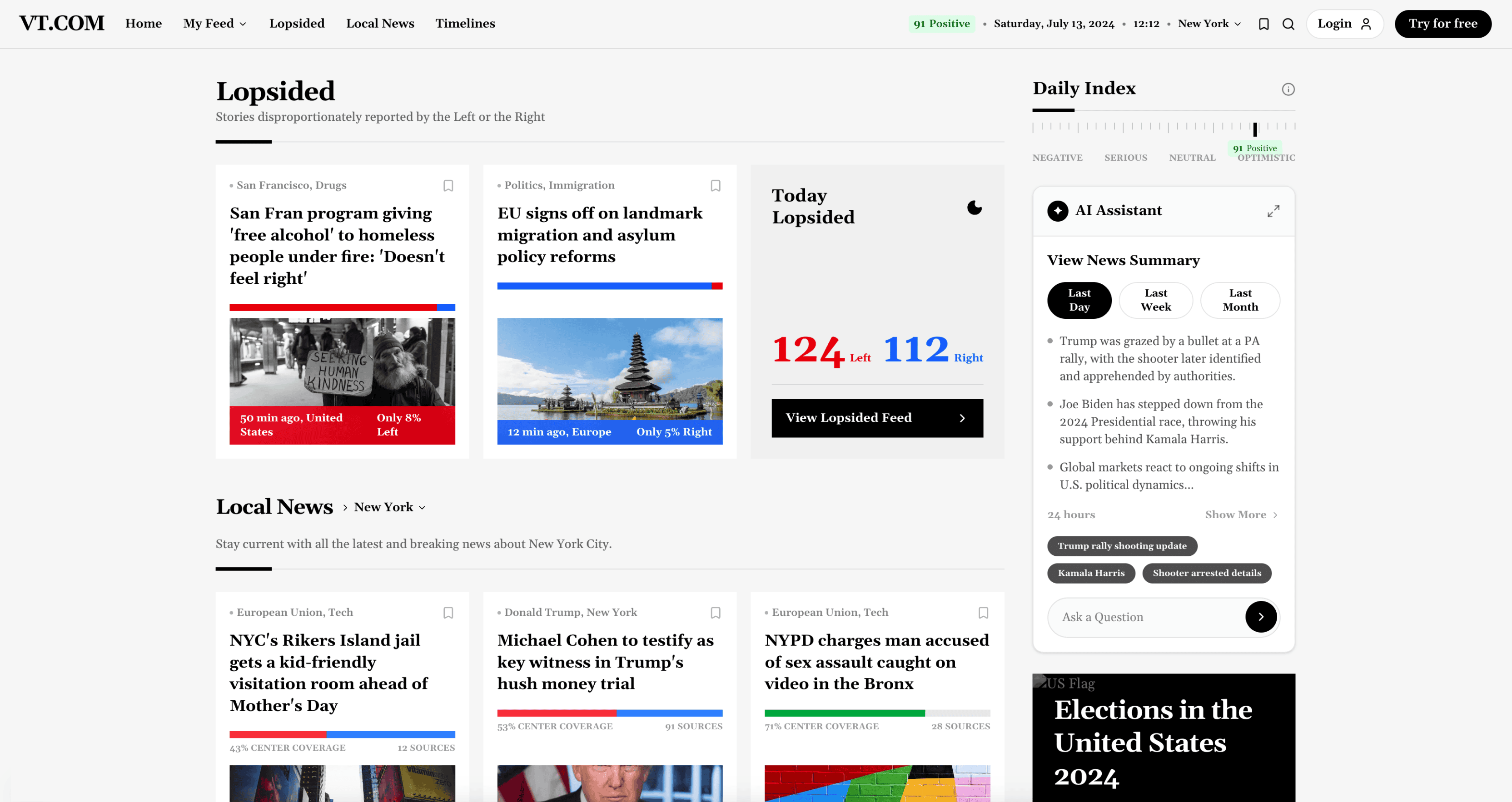
Bento
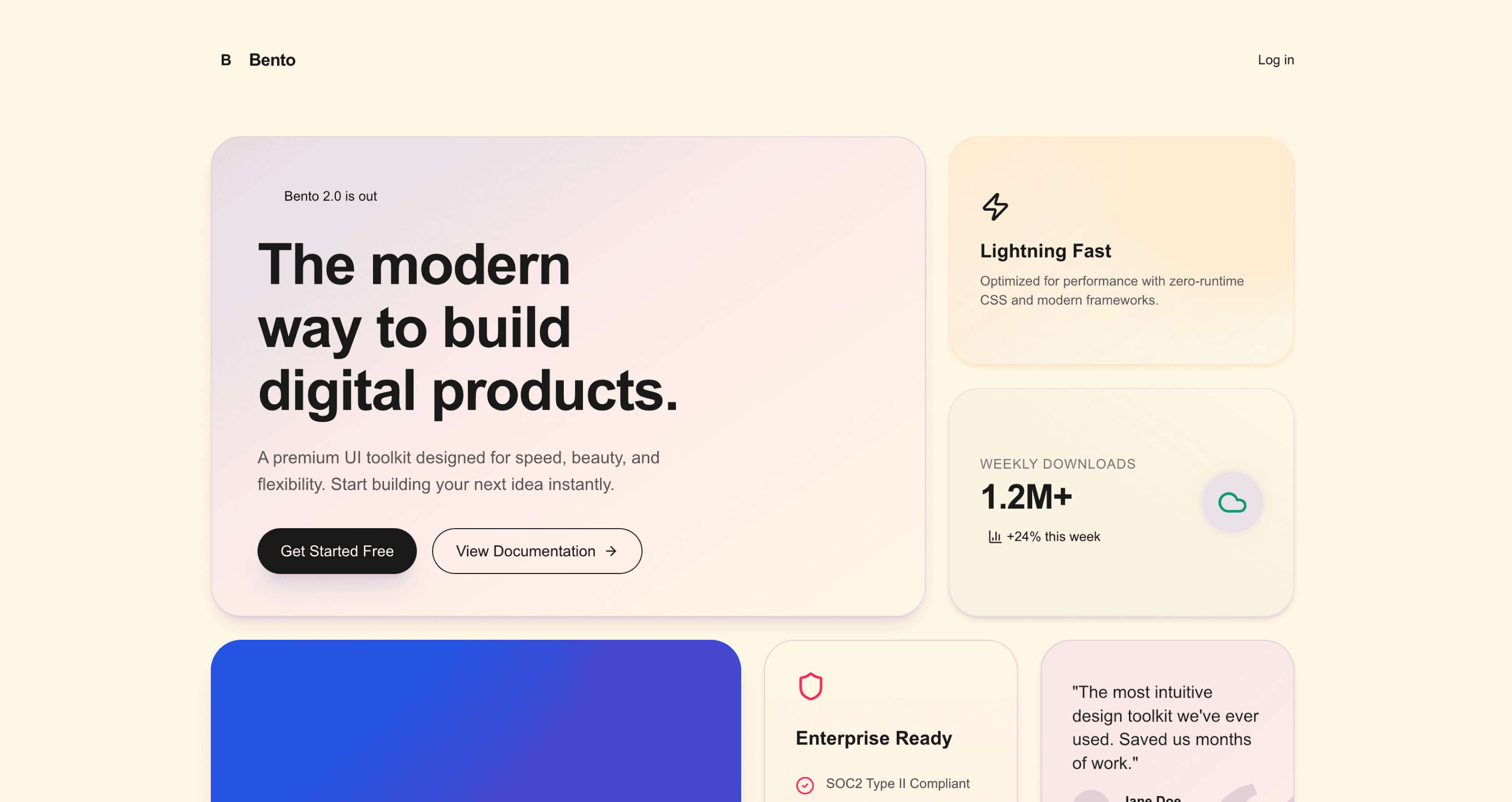
Bento is a clean, modular layout of card-like blocks with clear hierarchy, soft spacing, and subtle visual contrast. Designed to make content feel organized, scannable, and modern, this skill works beautifully for feature pages, dashboards, and product overviews with multiple data points.
Sleek
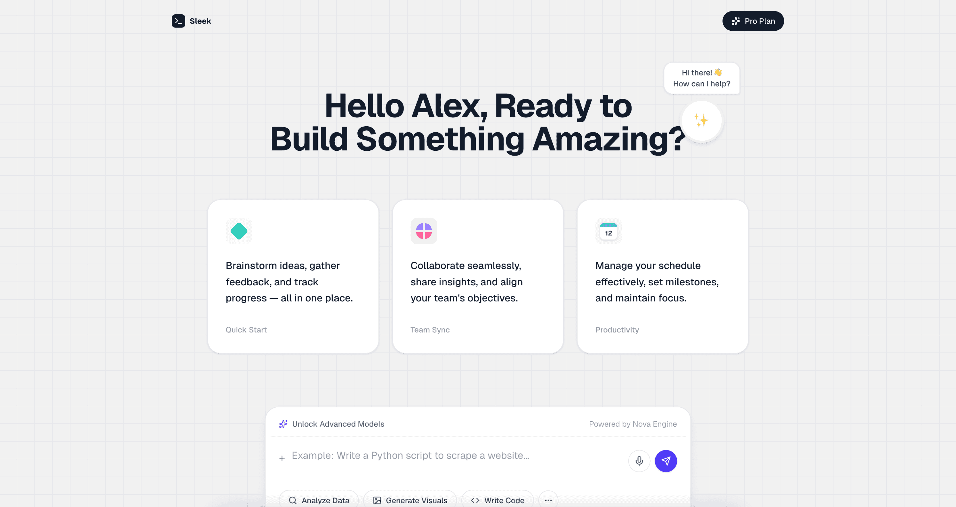
Sleek is streamlined and polished, with sharp typography, minimal clutter, and smooth visual rhythm that gives interfaces a fast, premium feel. This skill works well for developer tools, analytics dashboards, and tech products that want to look as performant as they are.
Vintage
Vintage evokes nostalgia through classic typography, muted palettes, and timeworn textures, giving interfaces a timeless, character-rich feel. This skill works for artisan brands, restaurants, photography portfolios, and projects where warmth and history are part of the identity.
View the Vintage design skill →
Pacman
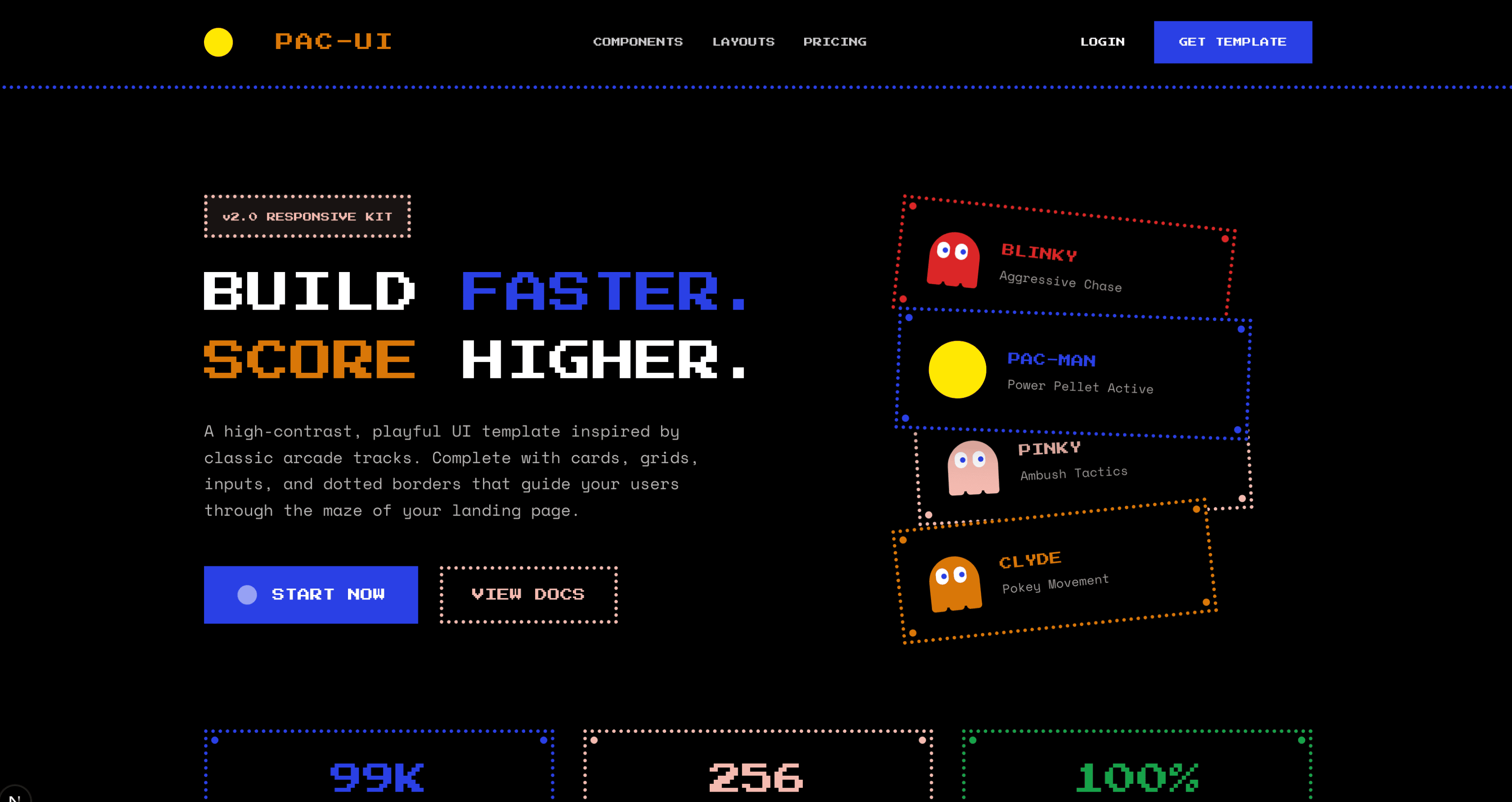
A playful, arcade-inspired design system featuring 8-bit aesthetics, vivid primary colors, and classic gaming motifs. Pacman is fun and unapologetically retro — perfect for game studios, hackathon projects, entertainment platforms, and anyone who wants their UI to put a smile on users' faces.
View the Pacman design skill →
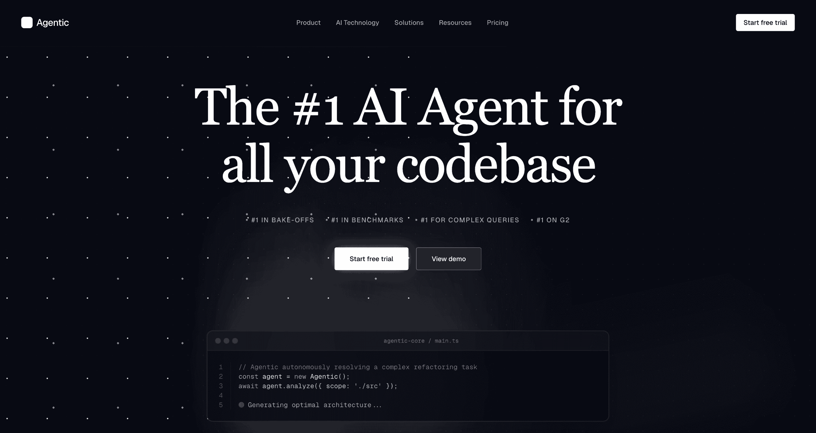
Futuristic
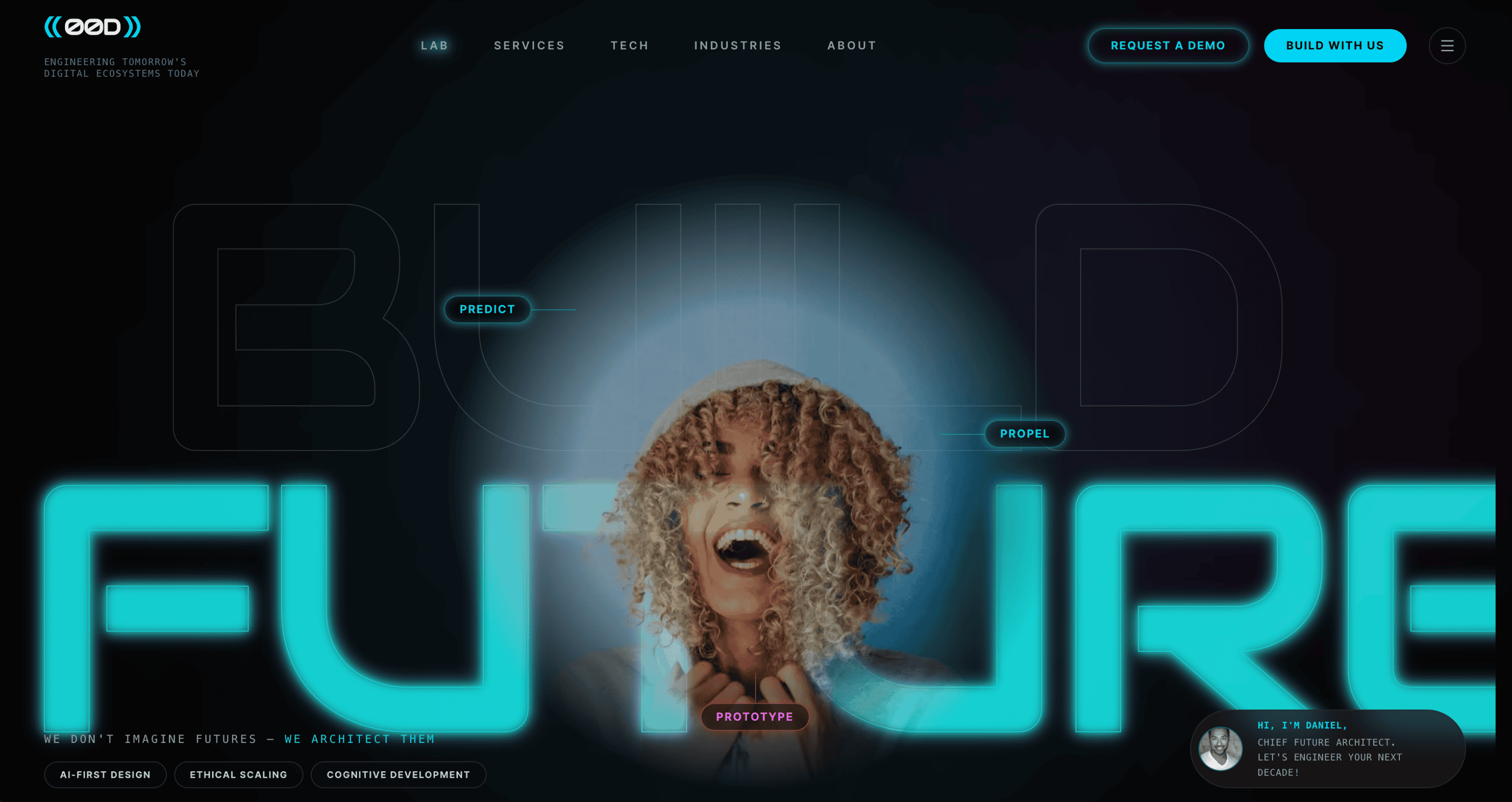
A forward-looking design system featuring sleek interfaces, glowing accents, and sci-fi inspired UI elements. Futuristic is built for AI products, space-tech startups, data platforms, and applications where the interface should signal innovation and cutting-edge technology.
View the Futuristic design skill →
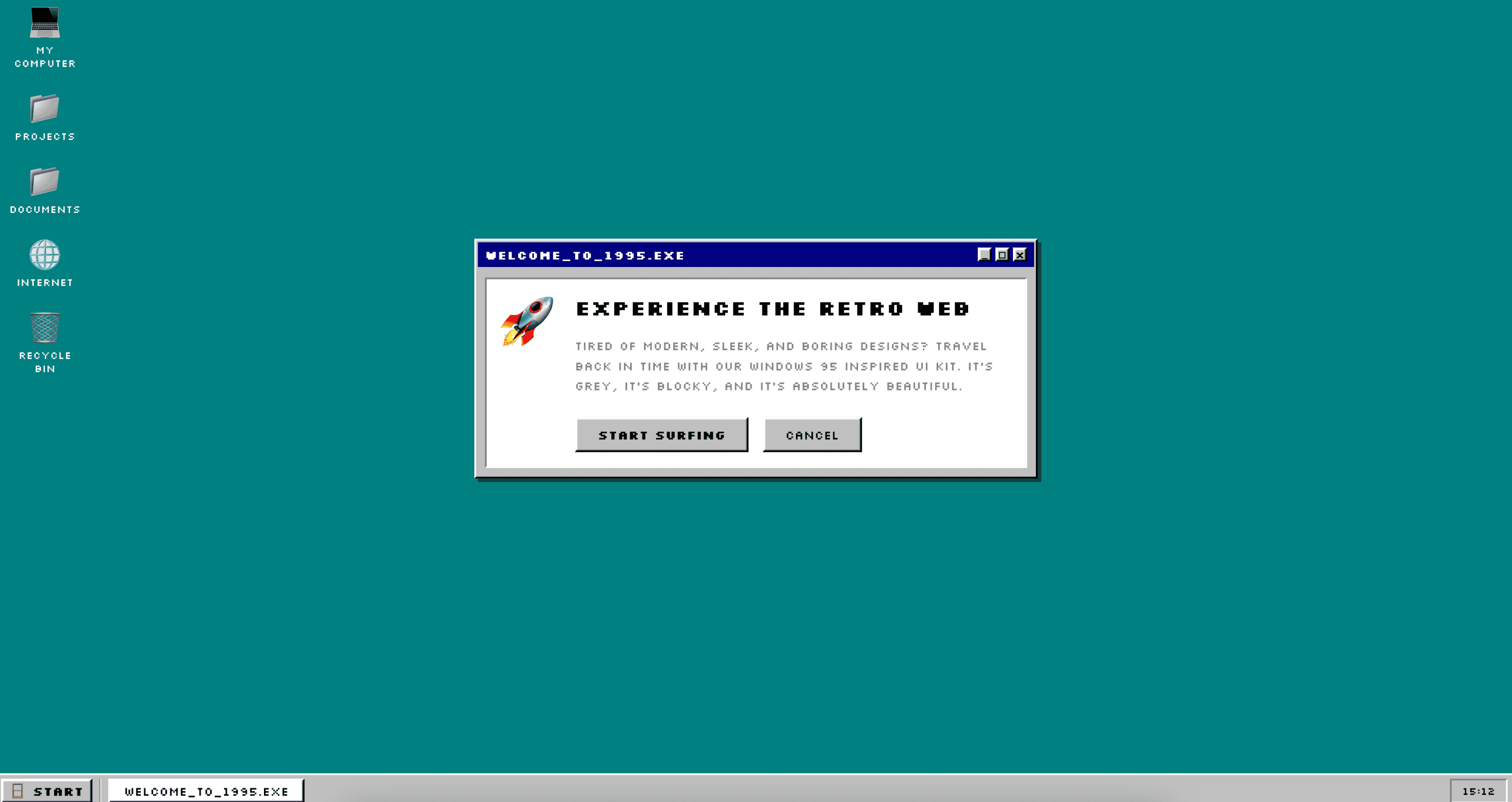
Retro
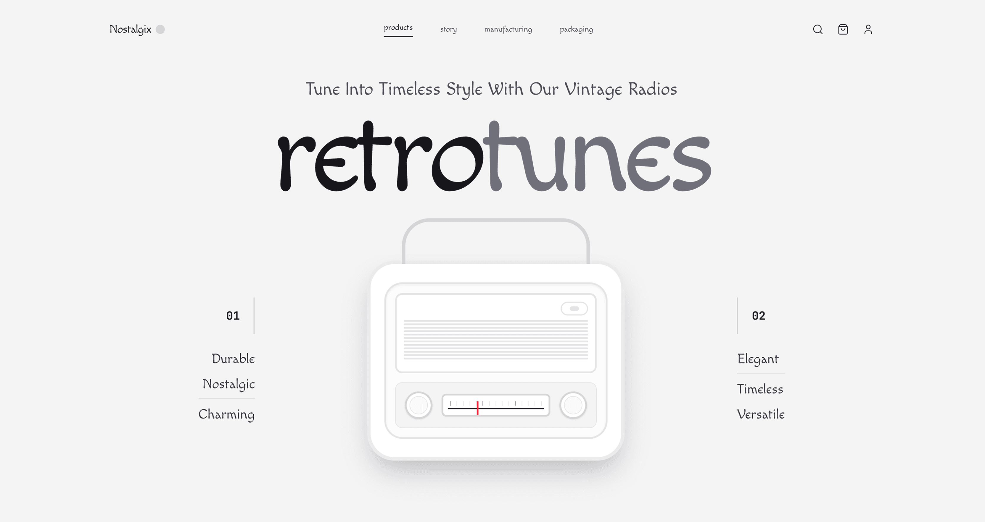
A nostalgic design system that brings back classic web aesthetics, pixelated details, and vintage color palettes. Retro is less polished than Vintage and more playful — it works for personal blogs, indie projects, and developers who miss the early web and want to celebrate it.
Dramatic
Dramatic uses bold contrast, striking typography, and high-impact visuals to create a powerful, attention-commanding interface. This skill is for product launches, media sites, and landing pages where the first impression needs to hit hard and hold attention.
View the Dramatic design skill →
Minimal
A stripped-down design system that removes all unnecessary noise, focusing purely on content and core functionality. Minimal goes further than Clean — it is the right choice when every element on the page needs to justify its existence. Ideal for personal sites, writing platforms, and single-purpose tools.
View the Minimal design skill →
Perspective
Perspective adds depth and direction through angled layouts, layered elements, and visual foreshortening, creating a dynamic interface with a strong sense of space. This skill is well-suited for architecture firms, 3D product showcases, and creative portfolios that want visual depth.
View the Perspective design skill →
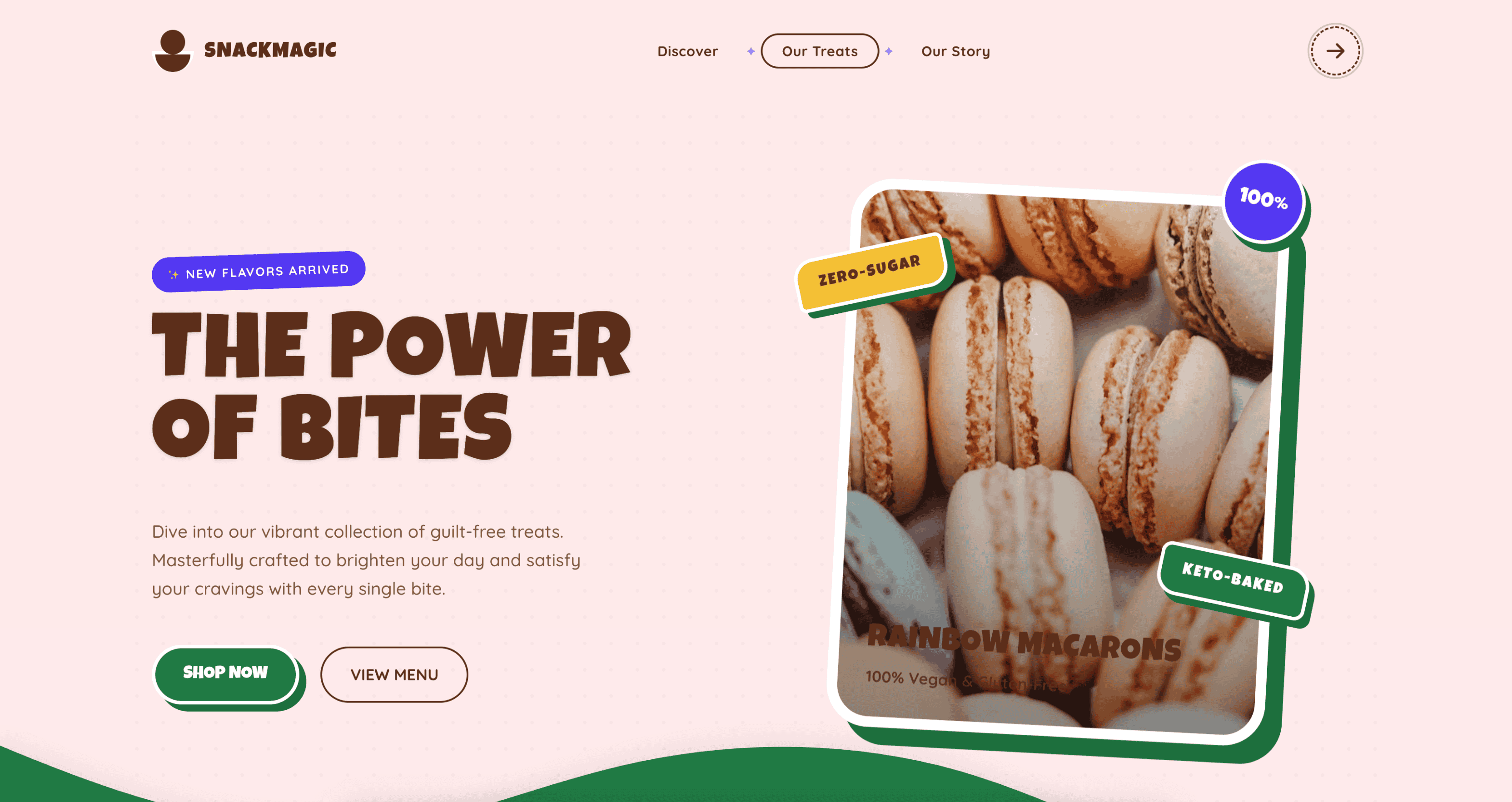
Friendly
Friendly feels warm and approachable, using soft shapes, clear hierarchy, and inviting visuals to make interactions easy and welcoming. This skill is built for onboarding flows, community platforms, healthcare apps, and any product where users need to feel comfortable from the first click.
View the Friendly design skill →
Artistic
A creative and expressive design system blending unique illustrations, unconventional layouts, and organic shapes. Artistic is for projects where the interface is as much a canvas as a tool — galleries, design studios, creative agencies, and experimental web experiences.
View the Artistic design skill →
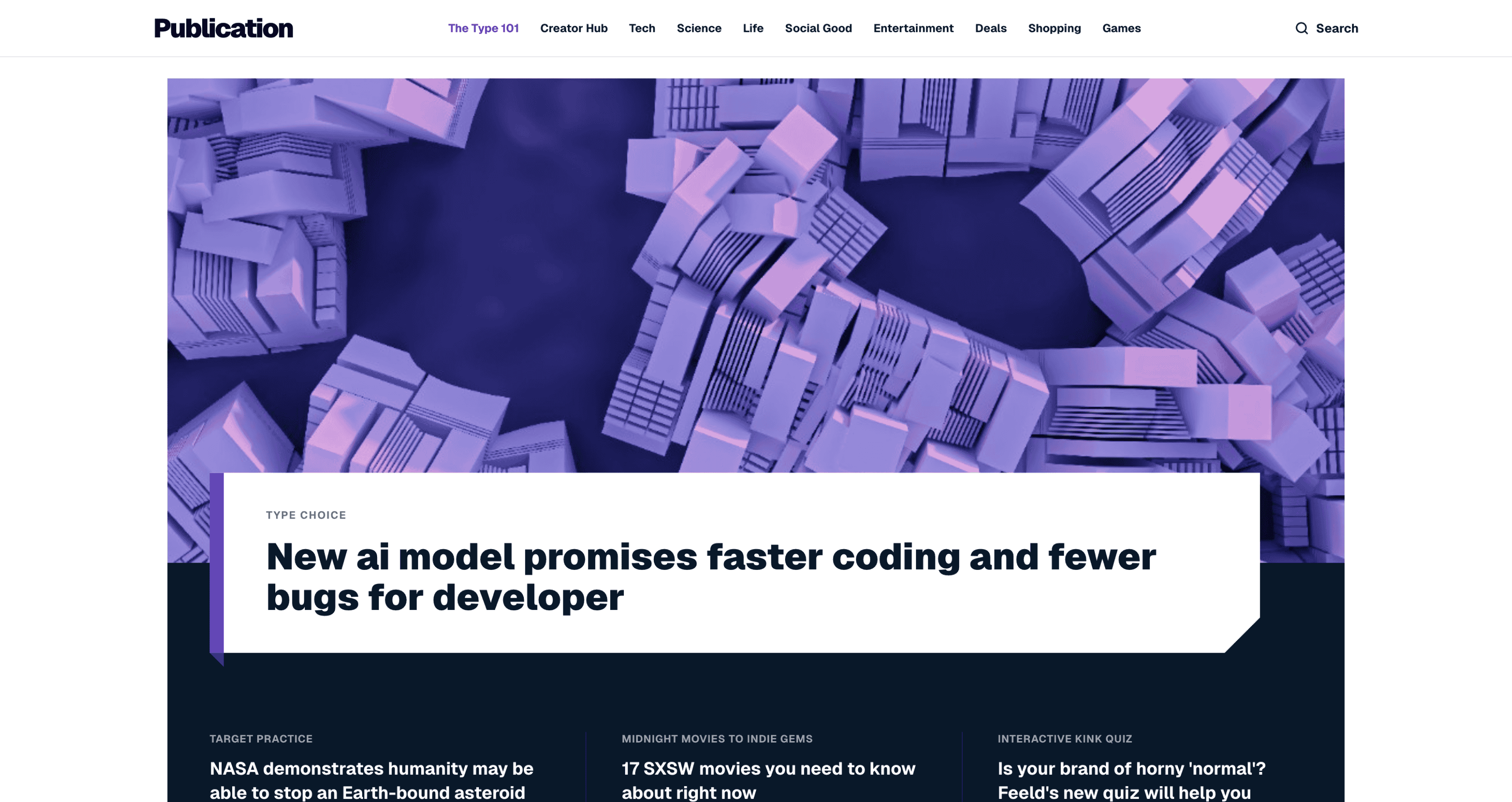
Editorial
A magazine-inspired design system prioritizing beautiful typography, structured layouts, and high-quality imagery. Editorial is built for publications, blogs, and media companies where the reading experience drives everything. Strong typographic hierarchy and measured whitespace make long-form content shine.
View the Editorial design skill →
Enterprise
A clean, high-contrast, professional design system for enterprise applications. Enterprise is battle-tested for complex interfaces with dense information — admin panels, CRM tools, project management platforms, and internal tools where usability at scale is the priority.
View the Enterprise design skill →
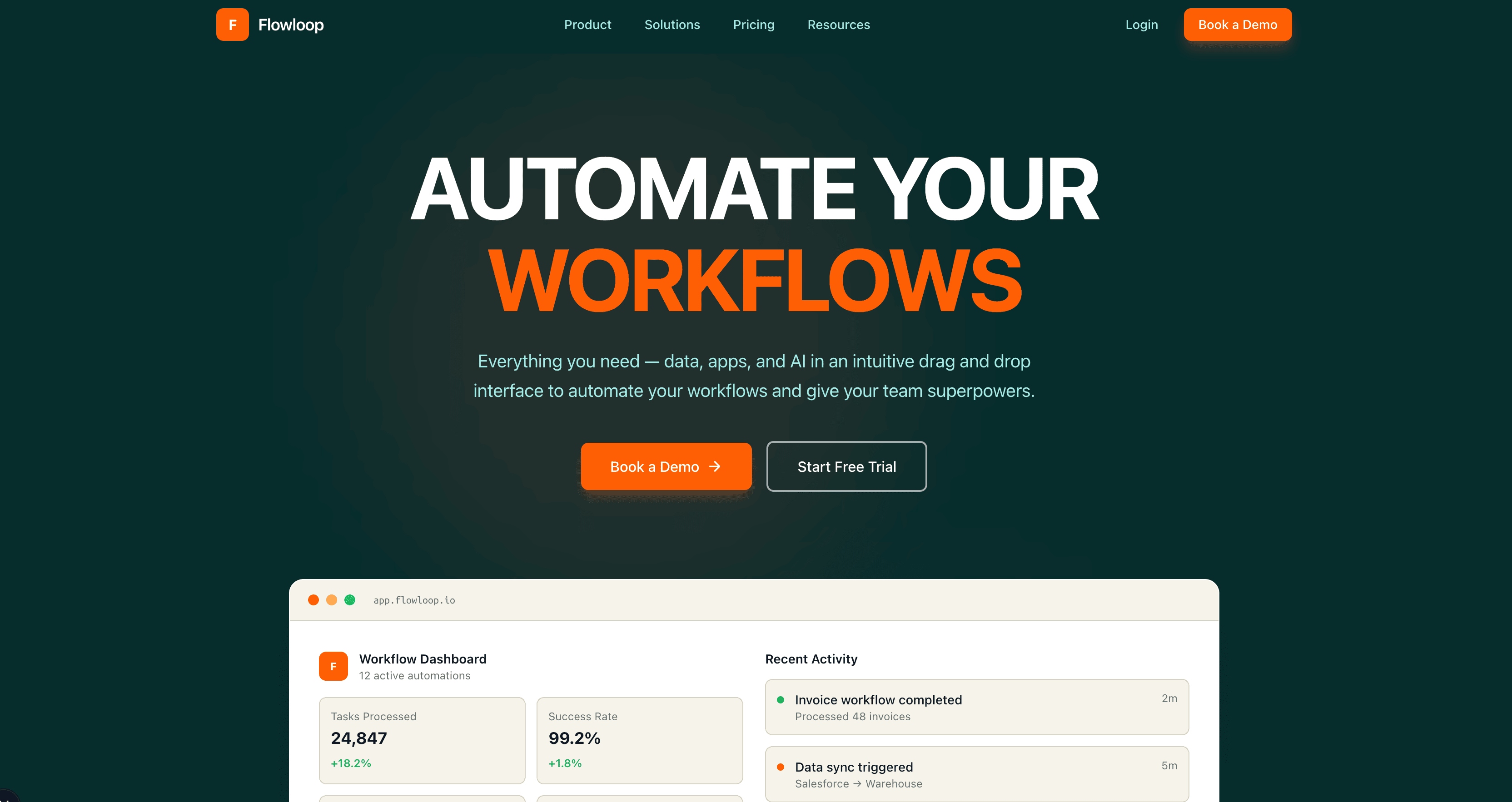
Bold
A high-impact design system featuring strong typography, stark contrasts, and unapologetic visual elements. Bold is for brands that want to make a statement — startup landing pages, campaign sites, and products that lead with confidence and refuse to blend in.
Neobrutalism
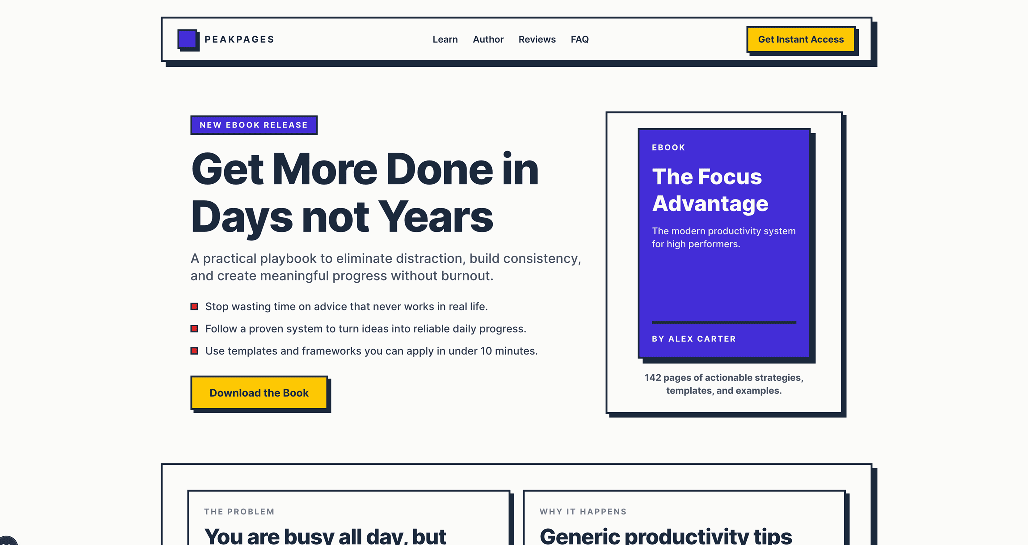
Neobrutalism is chunky shapes, hard edges, loud colors, and unapologetically simple layouts — raw, playful, and intentionally unpolished. This skill has become a favorite for indie hackers, developer tools, and creative projects that want a distinct anti-corporate aesthetic.
View the Neobrutalism design skill →
Shadcn
A highly customizable, accessible, and modern design system built on utility-first principles and clean components. If you are already familiar with shadcn/ui conventions and want your AI agent to generate components in that style, this skill keeps everything aligned.
View the Shadcn design skill →
Claymorphism
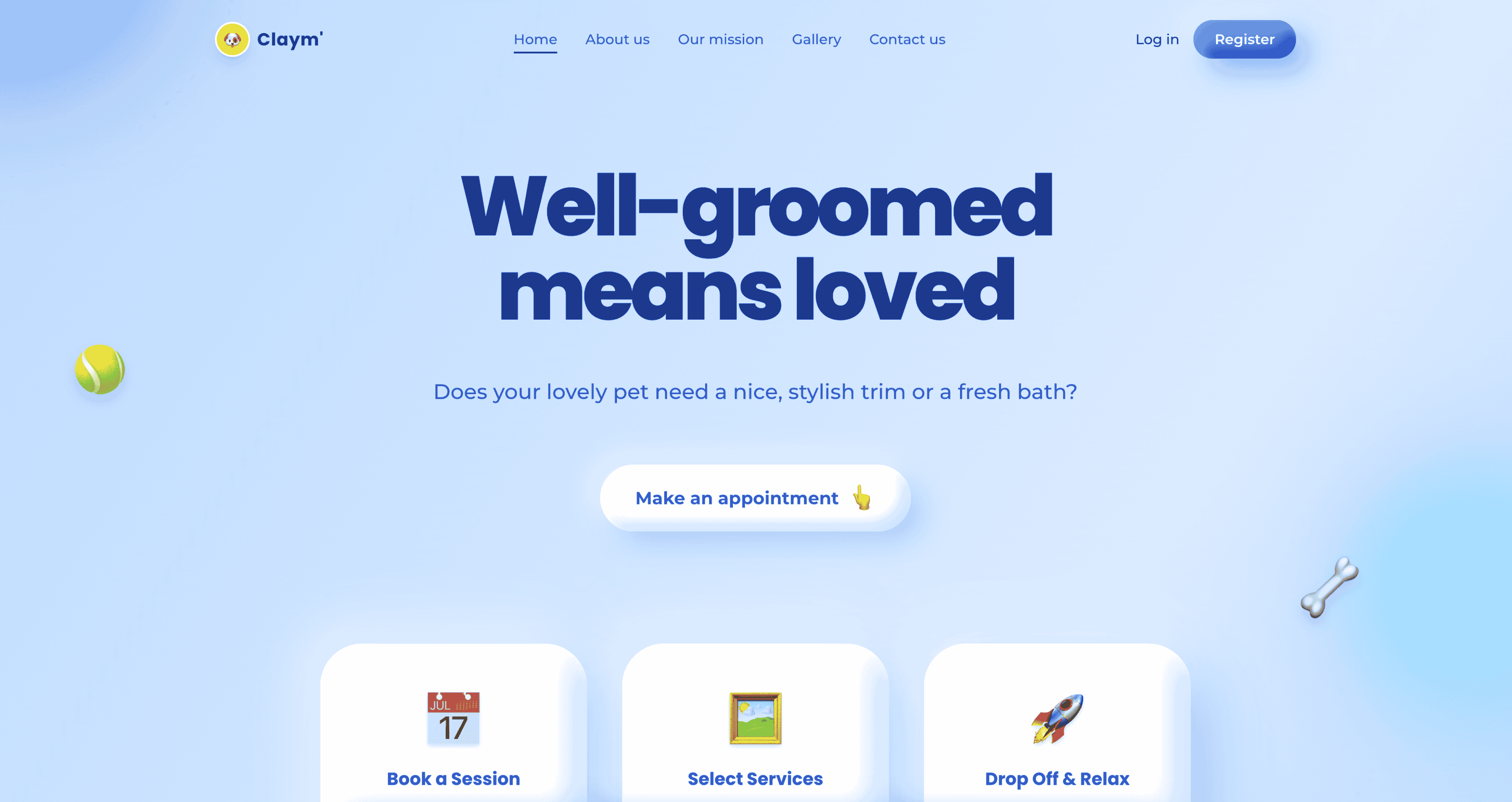
Claymorphism uses soft, rounded surfaces with subtle inner and outer shadows to create a playful, tactile interface that feels modern and touch-friendly. This skill is ideal for mobile-first apps, children's products, and any project that benefits from a friendly, 3D-like appearance.
View the Claymorphism design skill →
Gradient
Gradient uses smooth color transitions to create depth, energy, and visual focus, giving interfaces a modern, vibrant feel without heavy visual clutter. This skill works across marketing sites, AI products, and creative tools where color itself becomes a design element.
View the Gradient design skill →
Agentic
Agentic design feels proactive and intelligent, emphasizing guided actions, adaptive feedback, and clear next steps to help users accomplish goals faster. This skill is purpose-built for AI-native products, chatbot interfaces, automation dashboards, and tools where the interface anticipates what the user needs.
View the Agentic design skill →
Mono
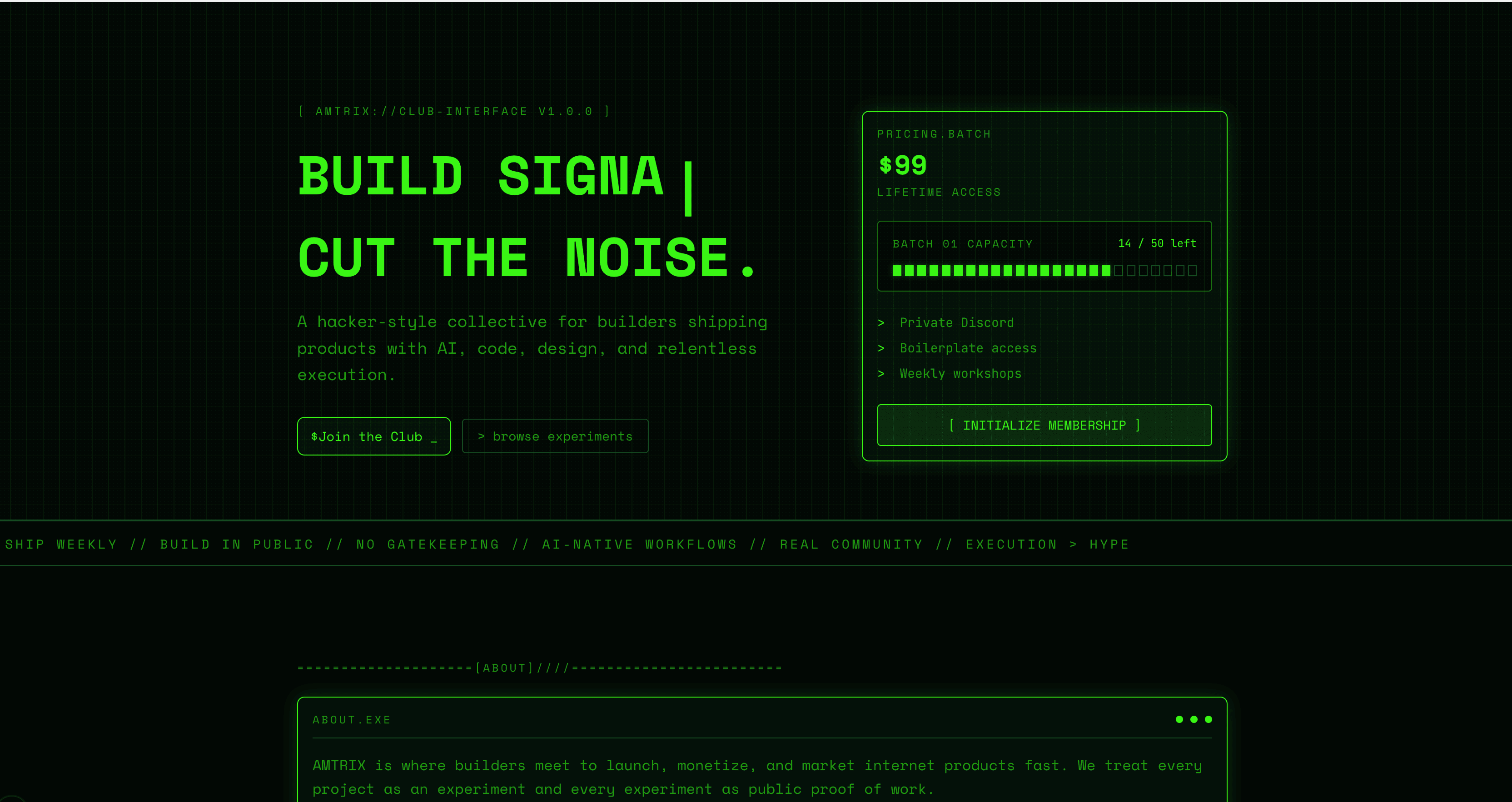
A playful, matrix-inspired monospaced design system where every character occupies the same width and the entire interface leans into terminal aesthetics. Mono works for developer portfolios, CLI documentation, hacker-themed projects, and anyone who thinks monospace fonts are underused in web design.
Refined
Refined is elegant and understated, using precise spacing, subtle contrast, and polished details to create a premium, professional interface. This skill sits between Elegant and Professional — less decorative than the former, warmer than the latter. A strong choice for fintech, legal, and consulting products.
View the Refined design skill →
Simple
A minimalist design system focused on clarity, essential UI elements, and highly intuitive user experiences. Simple strips away everything that is not necessary and keeps what remains well-organized. It is a good starting point for MVPs, prototypes, and products where speed of development matters.
View the Simple design skill →
Contemporary
Contemporary blends clean structure with bold, current aesthetics — crisp typography, balanced spacing, and subtle visual accents for a fresh, modern feel. This skill is for teams that want something that feels of-the-moment without committing to a specific trend.
View the Contemporary design skill →
Publication
Publication is editorial and content-first, combining strong typography, structured grids, and measured spacing to deliver clear, readable, long-form information. This skill is built for news sites, research platforms, documentation hubs, and any product where the written word takes center stage.
View the Publication design skill →
Cafe
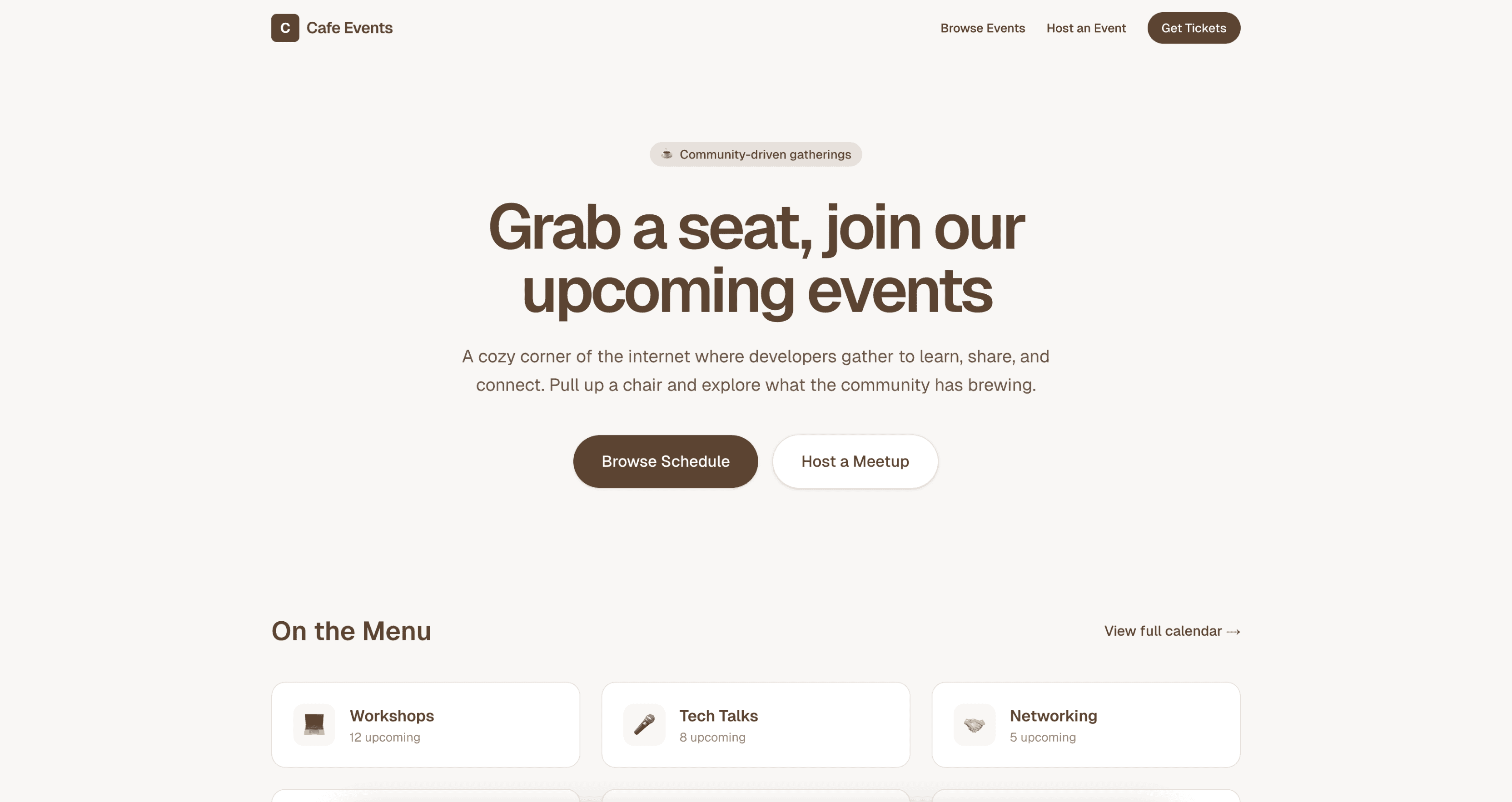
Cafe is warm and inviting, with earthy tones, cozy textures, and relaxed typography that create a handcrafted, welcoming atmosphere. This skill is perfect for restaurant sites, coffee shop apps, bakery brands, and local businesses that want their digital presence to feel as comfortable as their physical space.
How to pick the right design skill
With 48 options, choosing the right one depends on what you are building:
- SaaS and business tools — start with Enterprise, Professional, or Corporate
- Marketing and landing pages — try Bold, Dramatic, or Modern
- Creative and portfolio sites — look at Artistic, Creative, or Expressive
- Content and publishing — consider Editorial, Publication, or Paper
- Indie hacker projects — Levels, Neobrutalism, or Simple will get you moving fast
- AI-native products — Agentic, Futuristic, or Sleek match the vibe
- Playful and experimental — Pacman, Tetris, or Neon for something different
You can always switch skills between projects or even combine ideas from multiple skills by customizing the downloaded file.
What we do at TypeUI
At TypeUI, we build tools that help AI coding agents produce better design. Every skill in our registry is handcrafted, tested across multiple agents, and maintained as the AI ecosystem evolves.
Our design skills work with the tools you already use — Claude Code, Cursor, Codex CLI, Antigravity, and any agent that reads markdown files. You do not need to change your workflow. Just pull a skill and start building.
We believe that design quality should not depend on whether you remembered to describe your spacing scale in the prompt. It should be encoded once and followed everywhere. That is what design skills give you — a persistent design memory for your AI agent.
Browse all 48 skills on our design skills page, or pull one right now:
npx typeui.sh pull modern