
UI Foundations
Explore 118 interactive UI design examples covering typography, spacing, color, layout, animation, and accessibility. Compare design choices, customize previews, and copy AI prompts to build clear, consistent user interfaces.
118 foundations in 24 categories
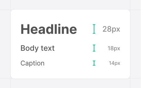
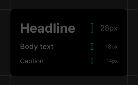
Type scale
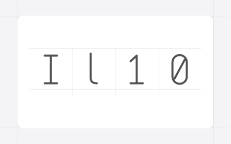
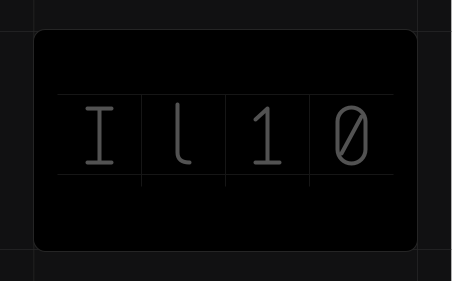
Readable fonts
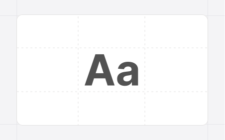
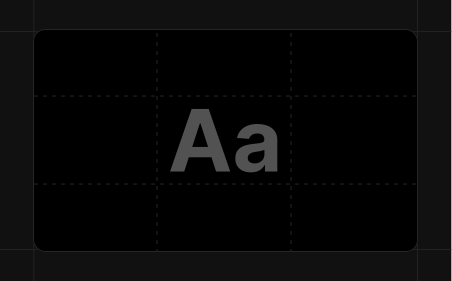
Font smoothing
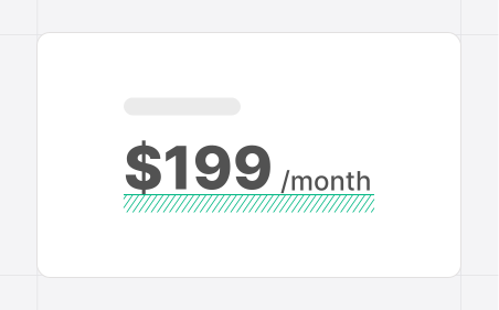
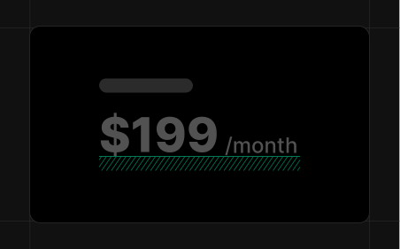
Baselines
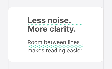
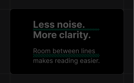
Line height
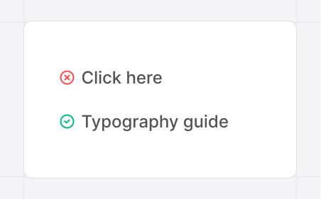
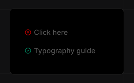
Descriptive links
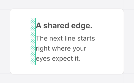
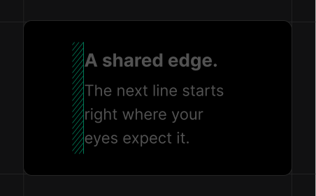
Text alignment
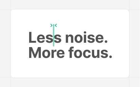
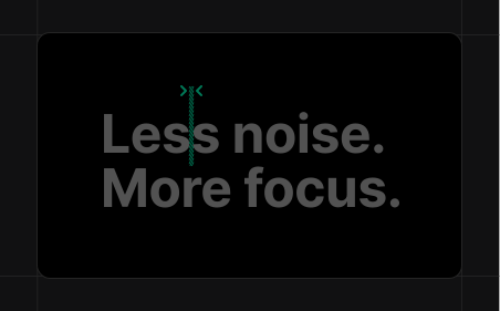
Letter spacing
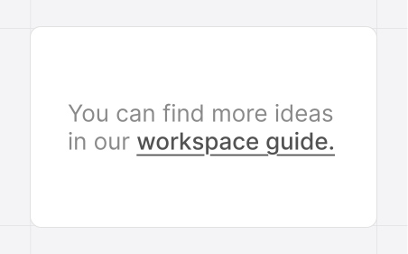
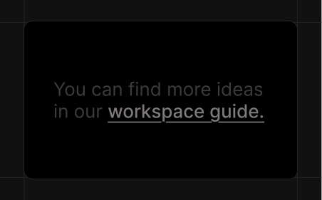
Obvious links
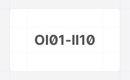
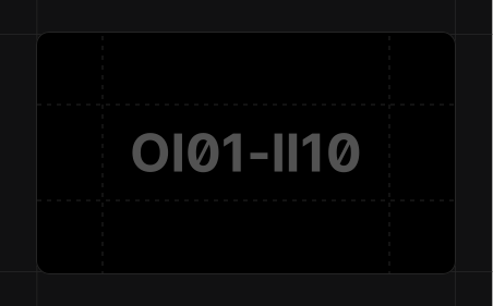
Clear characters
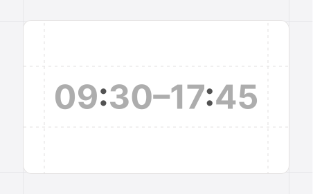
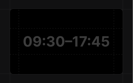
Contextual punctuation
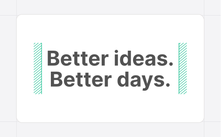

Headings
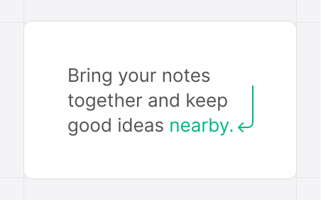
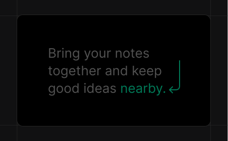
Descriptions
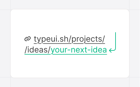
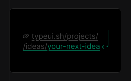
Long links
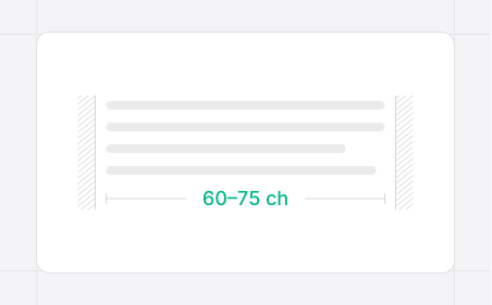
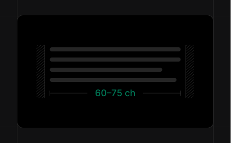
Line length
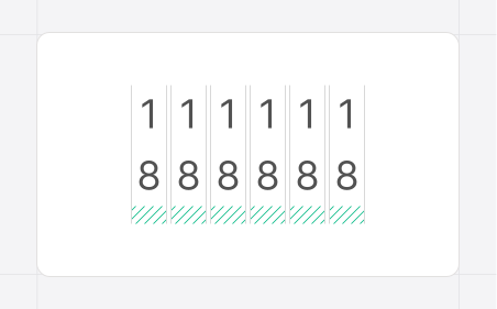
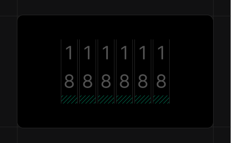
Tabular numbers
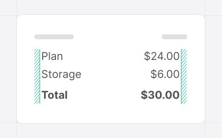
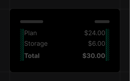
Typographic alignment
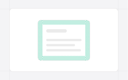
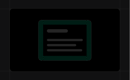
Breathing room
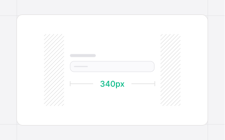
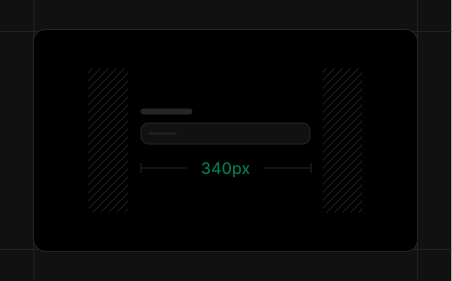
Input width
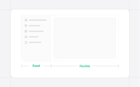
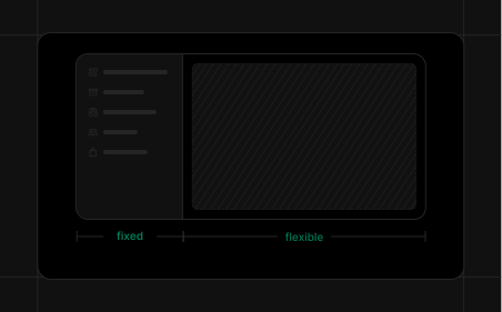
Content-sized
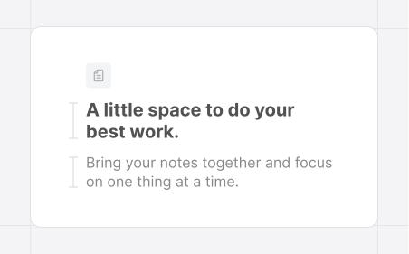
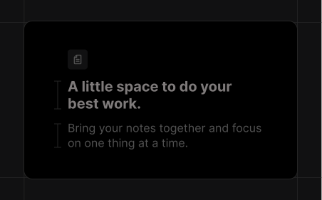
Scale by role
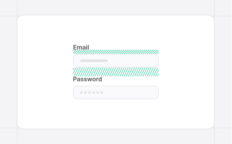
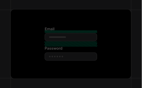
Clear groups
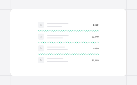
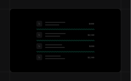
Section separators
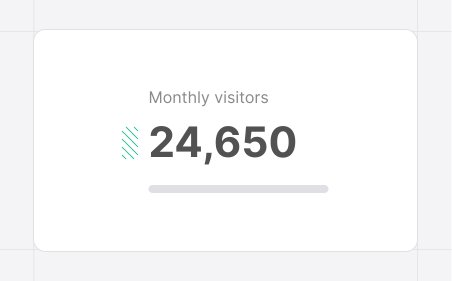

Importance
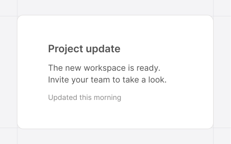
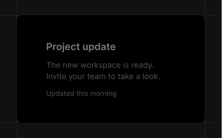
Beyond size
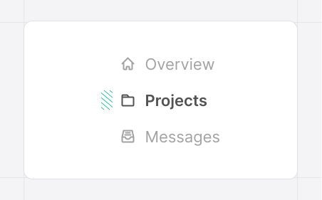
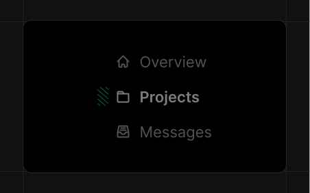
Action focus
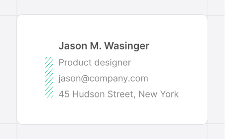

Labels & data
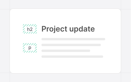
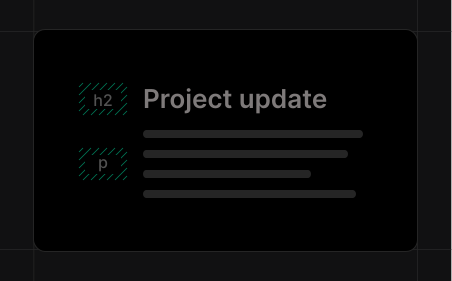
Heading roles
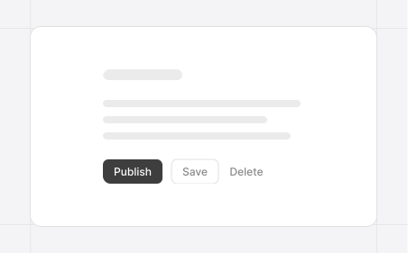
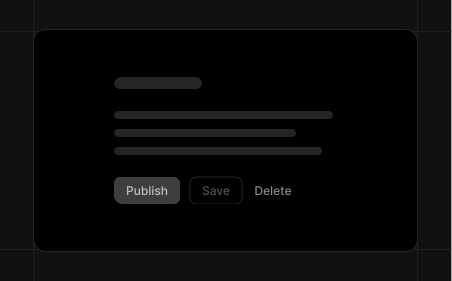
Action priority
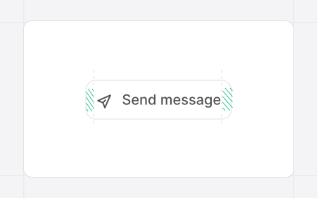
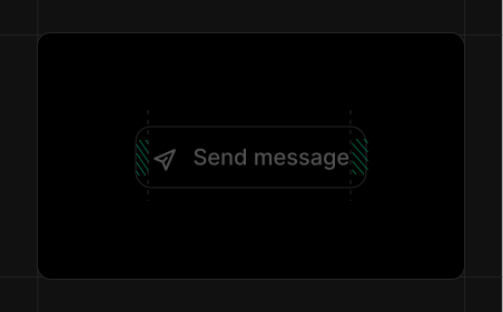
Button padding
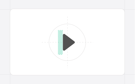
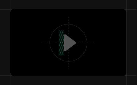
Icon balance
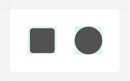
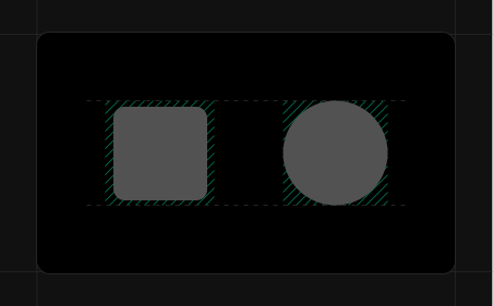
Icon area
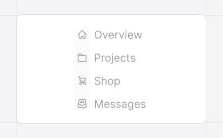
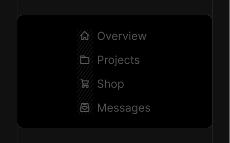
Color weight
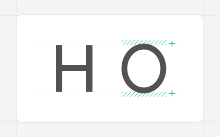
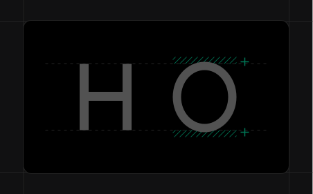
Glyph overshoot
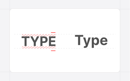
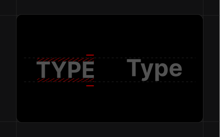
Case scale
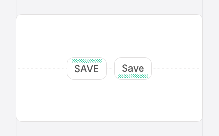
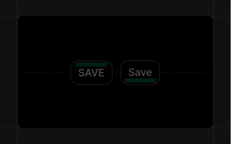
Button label
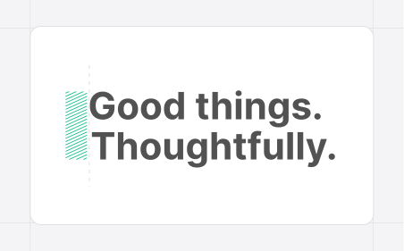

Letter alignment
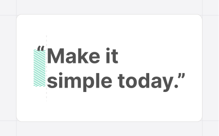
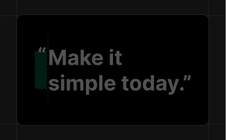
Hanging marks
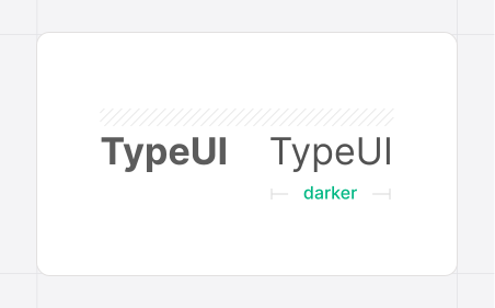
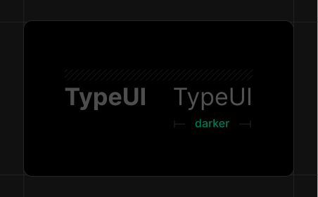
Weight colour
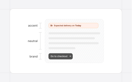
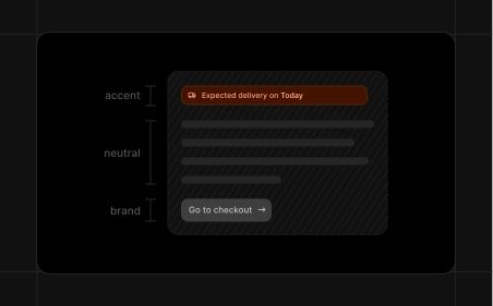
Palette roles
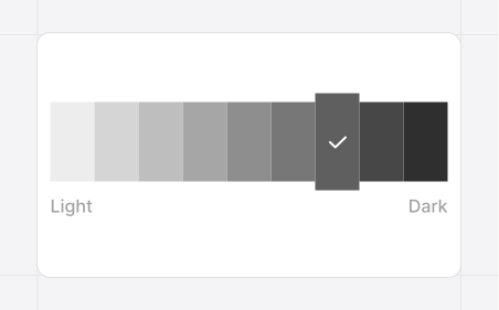
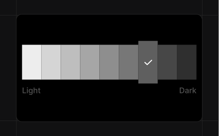
Shade scale
Rich tints
Visual distinction
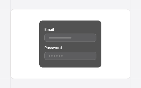
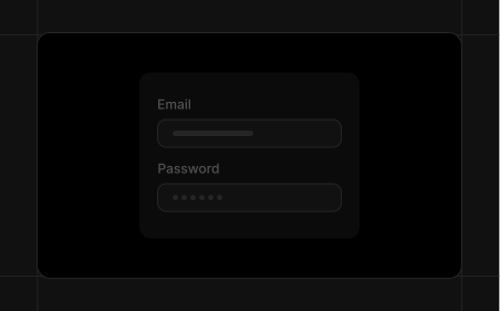
Input contrast
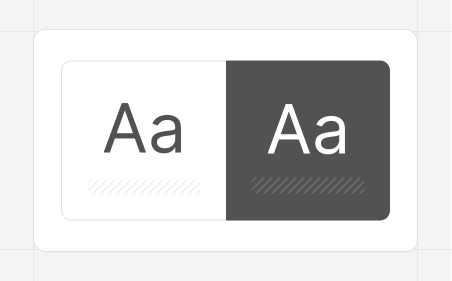
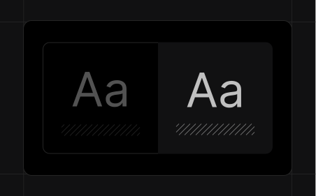
Text contrast
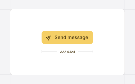
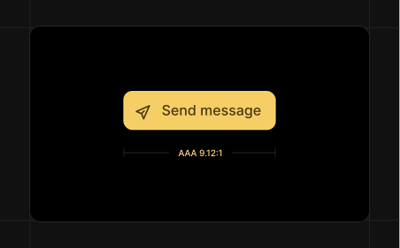
Button contrast
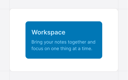
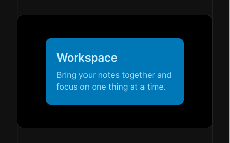
Text on color
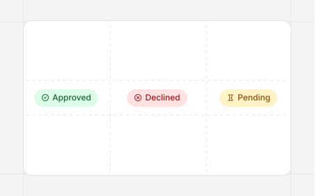
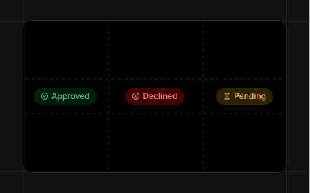
Readable color
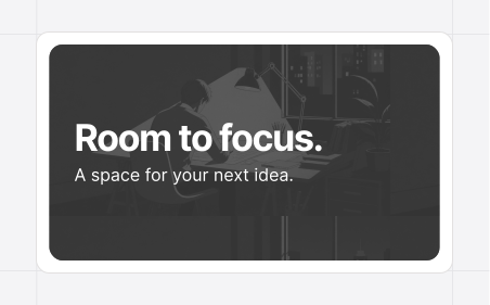
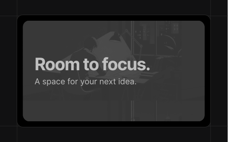
Text over images
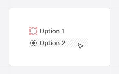
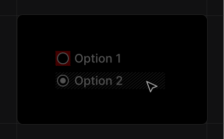
Clickable labels
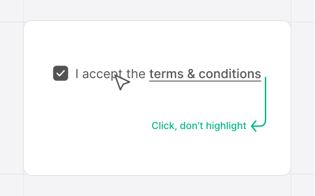
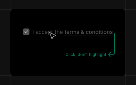
Label selection
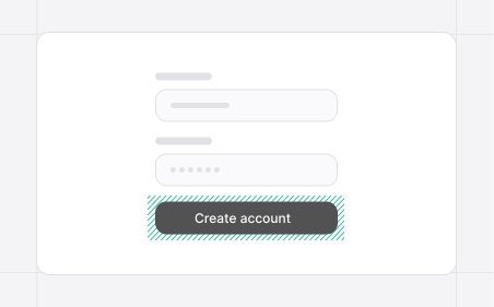
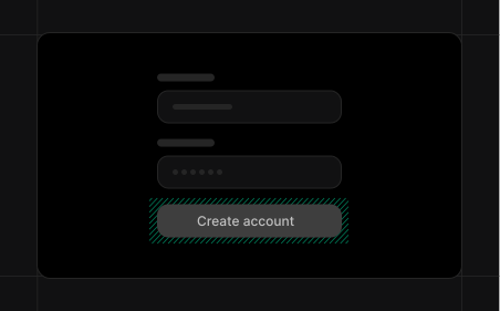
Recognizable buttons
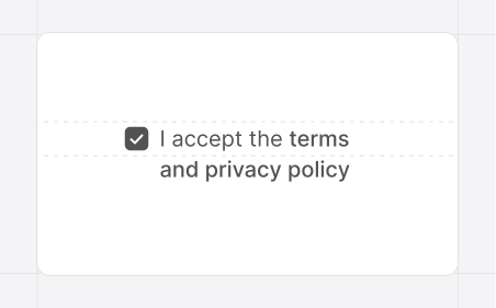
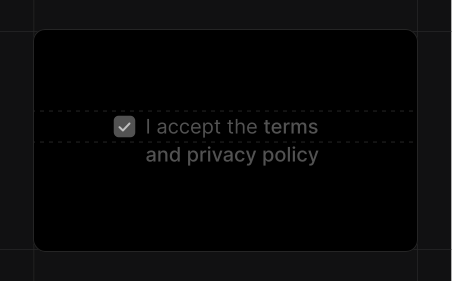
Wrapped labels
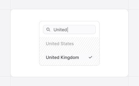
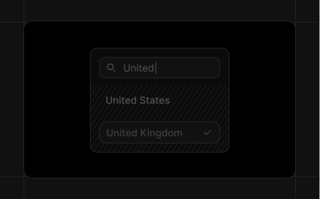
Search over scrolling
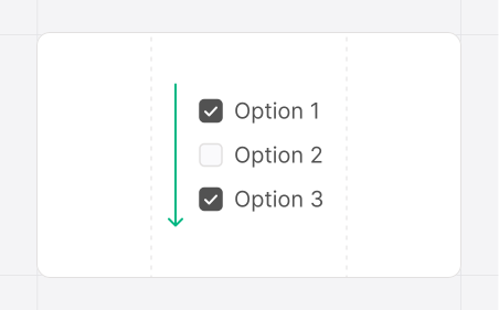
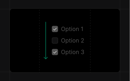
One-column choices
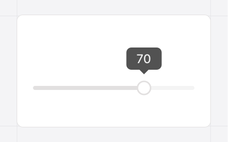
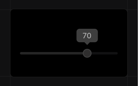
Value clarity
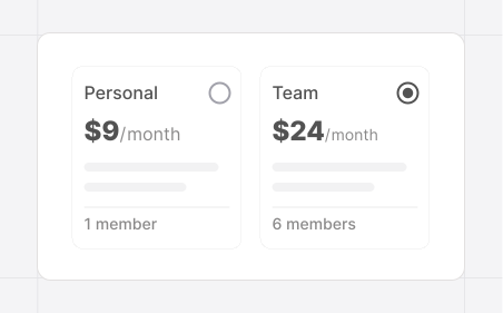
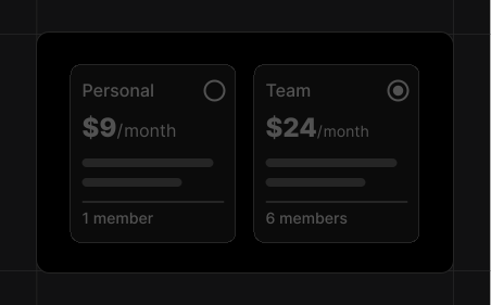
Comparable options
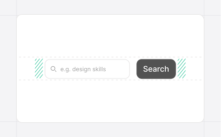
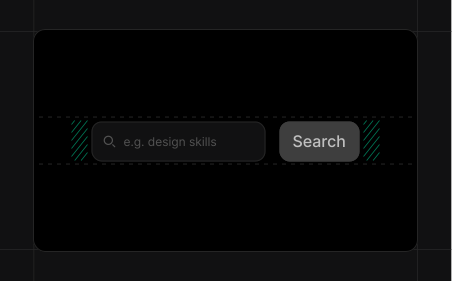
Search
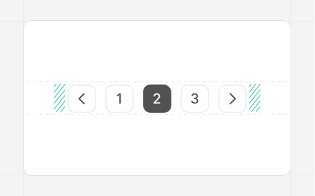
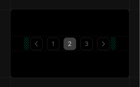
Pagination
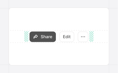
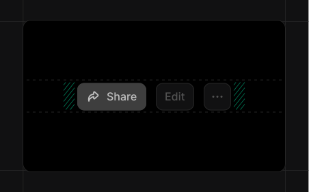
Action toolbar
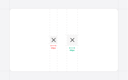
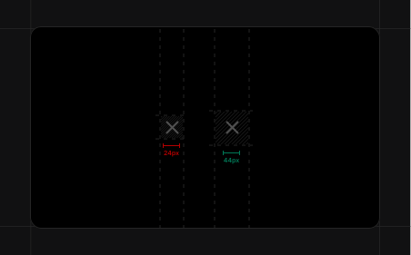
Icon targets
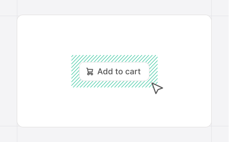
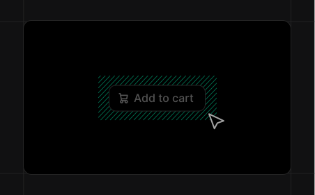
Button targets
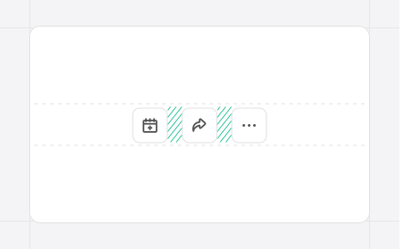
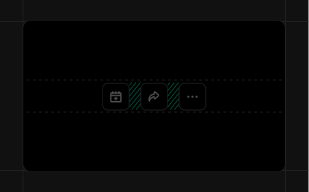
Target spacing
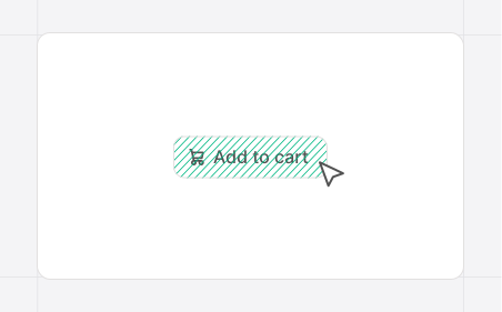
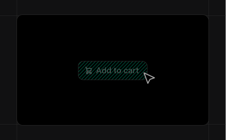
Target coverage
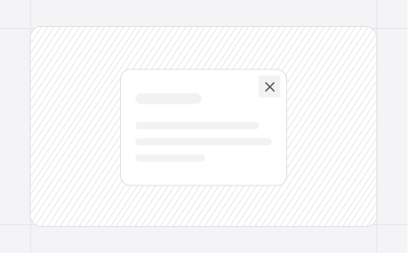
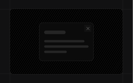
Close buttons
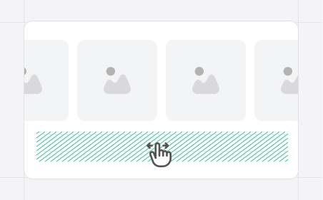
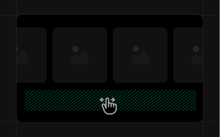
Room to swipe
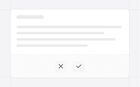
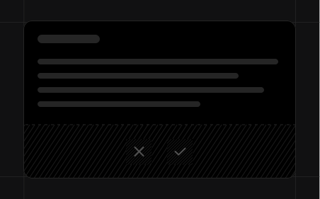
Touch visibility
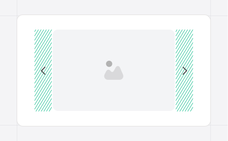
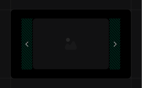
Edge navigation
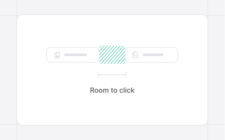
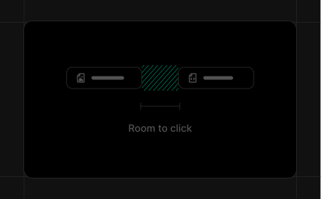
Room to click
Focus visibility
Status signals
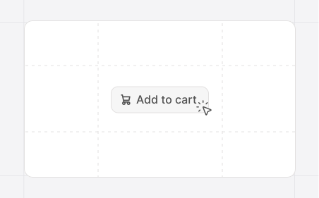
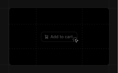
Action feedback
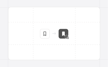
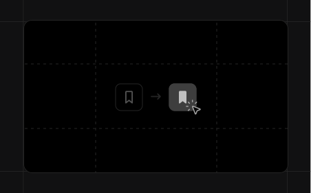
Toggle feedback
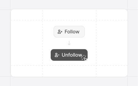
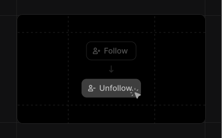
Selection feedback
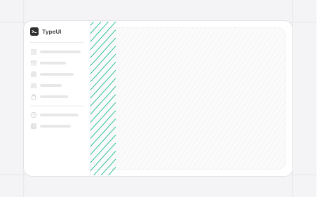
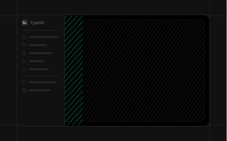
Sidebar
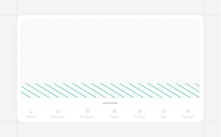
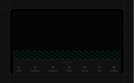
Bottom sheet
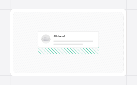
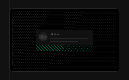
Popover
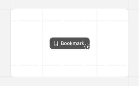
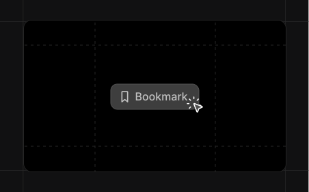
Squash & stretch
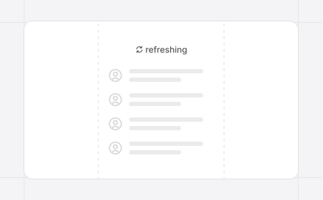
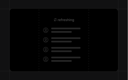
Anticipation
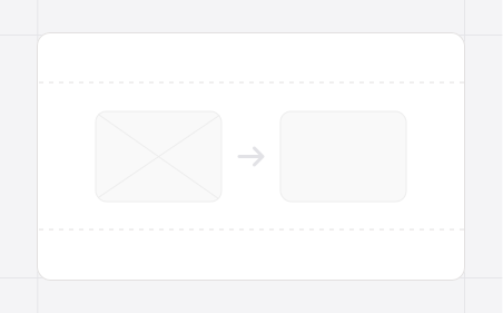
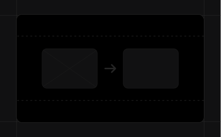
Clear motion paths
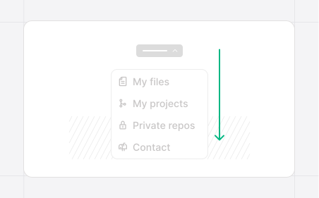
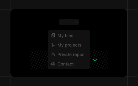
Follow through & overlap
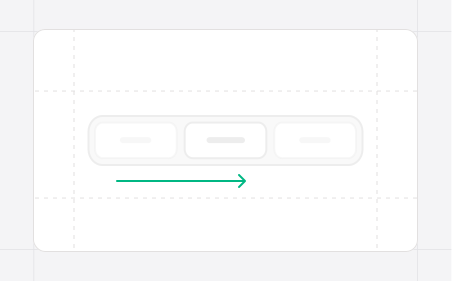
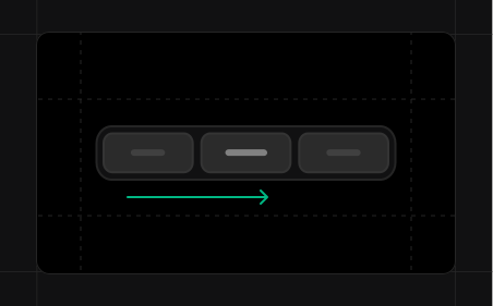
Slow in & slow out
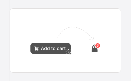
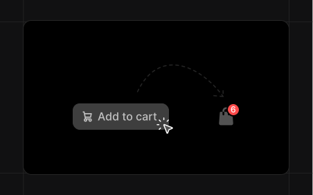
Arcs
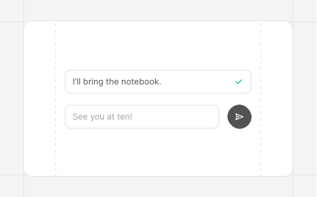
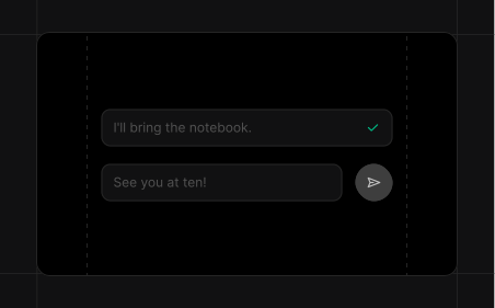
Feedback without distraction
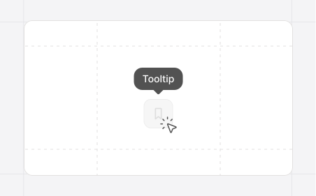
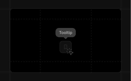
Timing
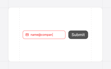
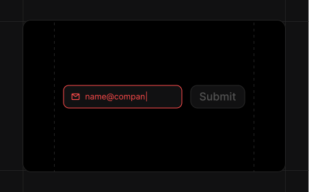
Noticeable errors
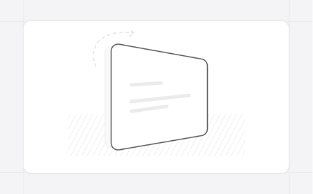
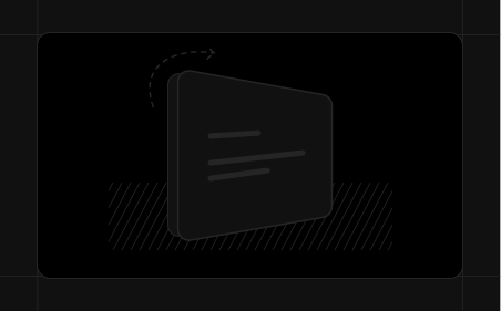
Readable flips
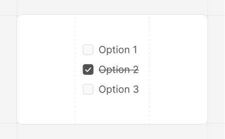
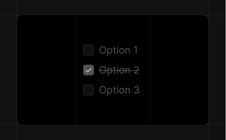
Consistent feedback
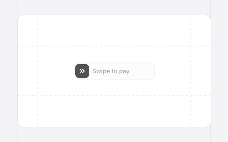
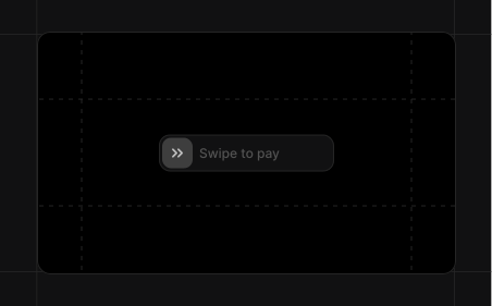
Responsive gesture
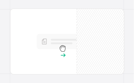
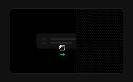
Cancelable gesture
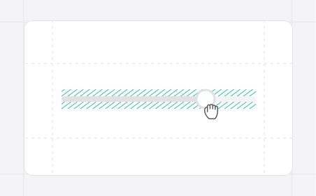
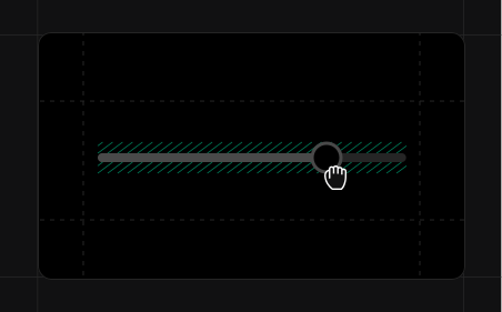
Continuous gesture
Responsive feedback
Card + inset image
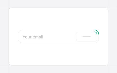
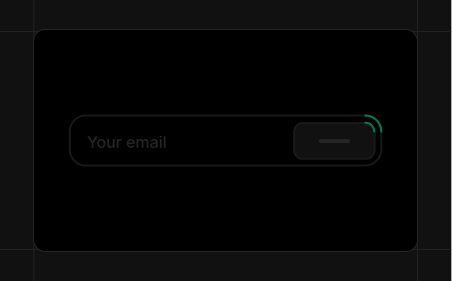
Input + inset button
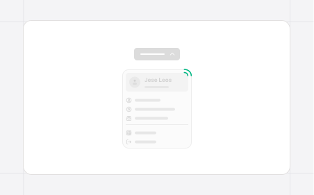
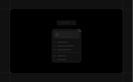
Dropdown + inset header
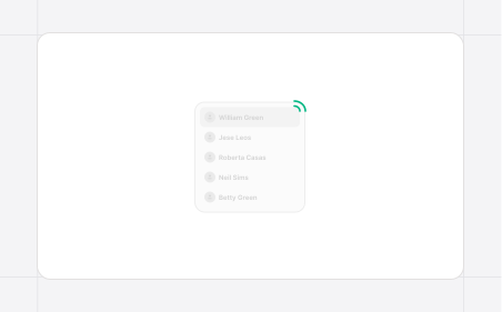
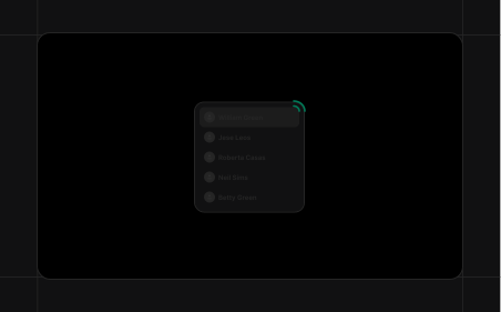
Navigation + inset highlight
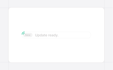
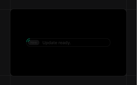
Alert + inset badge
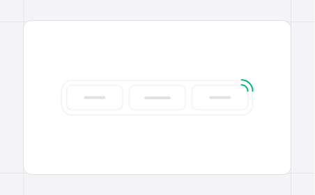
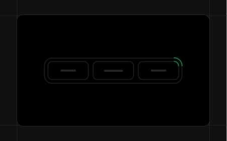
Tabs + inset selection
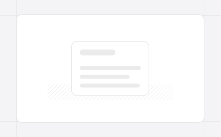
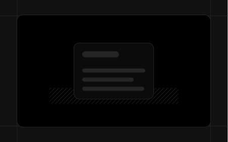
Base surface
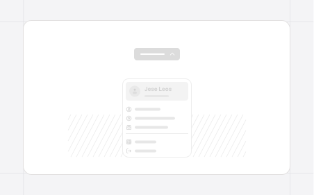
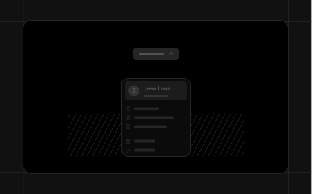
Dropdown layer
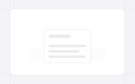
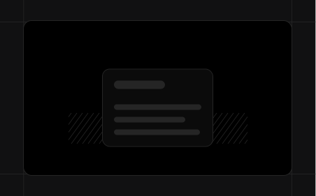
Raised card
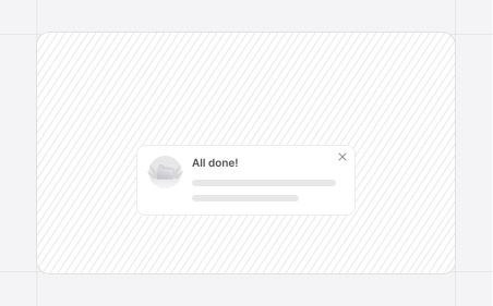
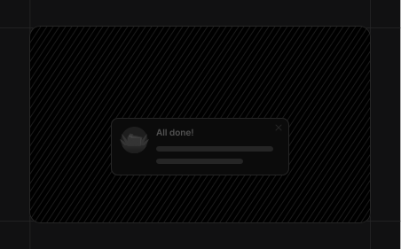
Floating notification
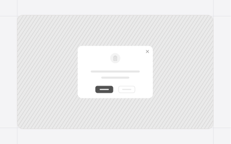
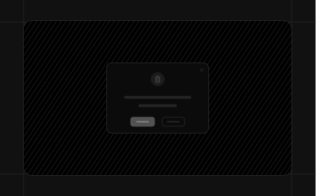
Modal depth
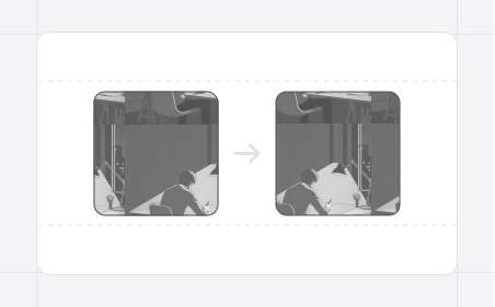
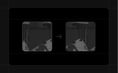
Photo quality
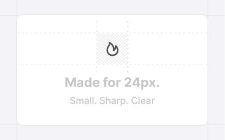
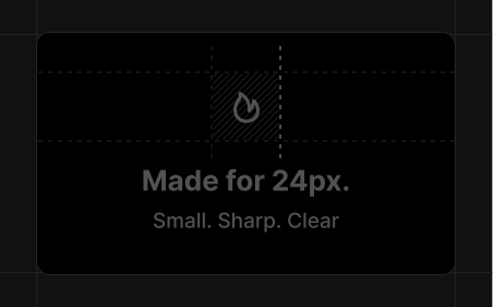
Intended size
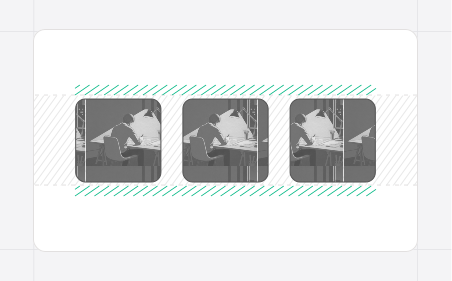
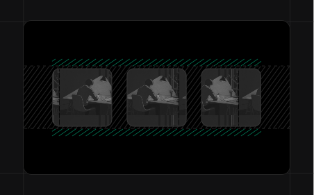
Consistent frames
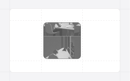
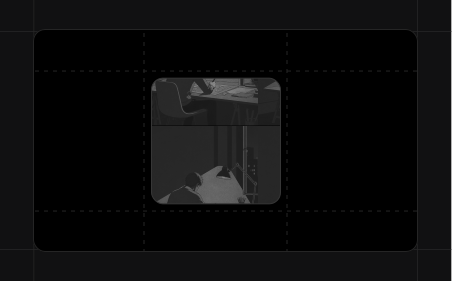
Image outline
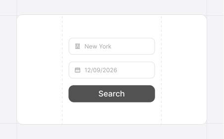
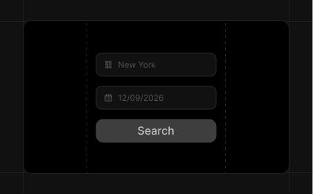
Feature first
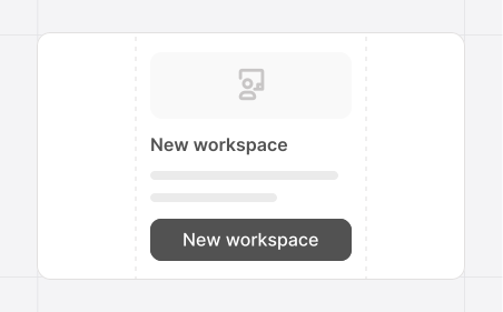
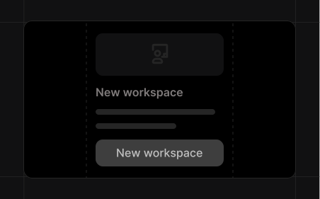
Structure first
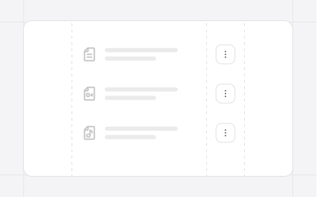
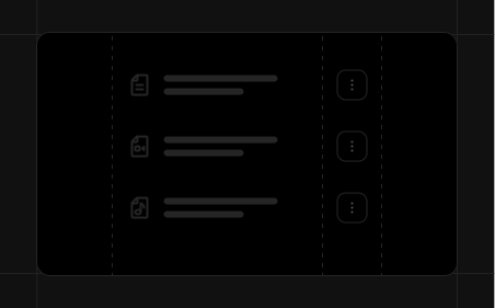
Action placement
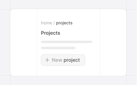
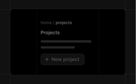
Consistent names
Personality
Shared styles
Meaningful list icons
Accent borders

Quiet backgrounds
Empty states